- Home
- Microsoft Edge Insider
- Discussions
- Reverse most UI changes in 111.0.1660.6
Reverse most UI changes in 111.0.1660.6
- Subscribe to RSS Feed
- Mark Discussion as New
- Mark Discussion as Read
- Pin this Discussion for Current User
- Bookmark
- Subscribe
- Printer Friendly Page
- Mark as New
- Bookmark
- Subscribe
- Mute
- Subscribe to RSS Feed
- Permalink
- Report Inappropriate Content
Feb 07 2023 11:43 AM - edited Feb 07 2023 11:47 AM
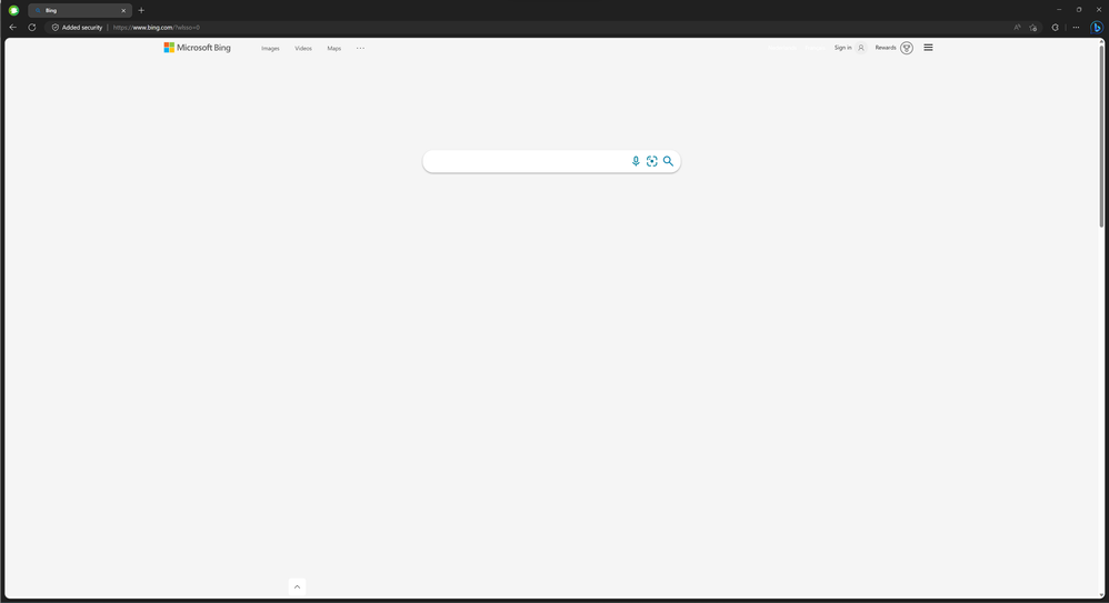
The new UI introduced in today's 111.0.1660.6 update is honestly terrible.
Why is there such a big border around the client area and every sidebar? It's no longer possible to just put your cursor to the right and scroll, because now the window frame is there wasting space. Why can that massive Bing button, now taking up the space of where the menu button previously was, not be disabled and/or be made less obnoxious and fit in with every other icon in the browser? Why can neither be disabled?
This is some genuinely astonishing bad design. Wasting space on purpose and shoving features in users faces that don't want to.
I'm genuinely excited to try out the new Bing, but come one, this is just going to push a *lot* of people away.
