- Home
- Microsoft Edge Insider
- Discussions
- Re: is this new logo for edge chromium?
is this new logo for edge chromium?
- Subscribe to RSS Feed
- Mark Discussion as New
- Mark Discussion as Read
- Pin this Discussion for Current User
- Bookmark
- Subscribe
- Printer Friendly Page
Nov 02 2019 09:09 PM
- Mark as New
- Bookmark
- Subscribe
- Mute
- Subscribe to RSS Feed
- Permalink
- Report Inappropriate Content
Nov 02 2019 09:09 PM
https://www.theverge.com/2019/11/2/20944341/microsoft-edge-chromium-browser-logo-icon-wave-surf-new
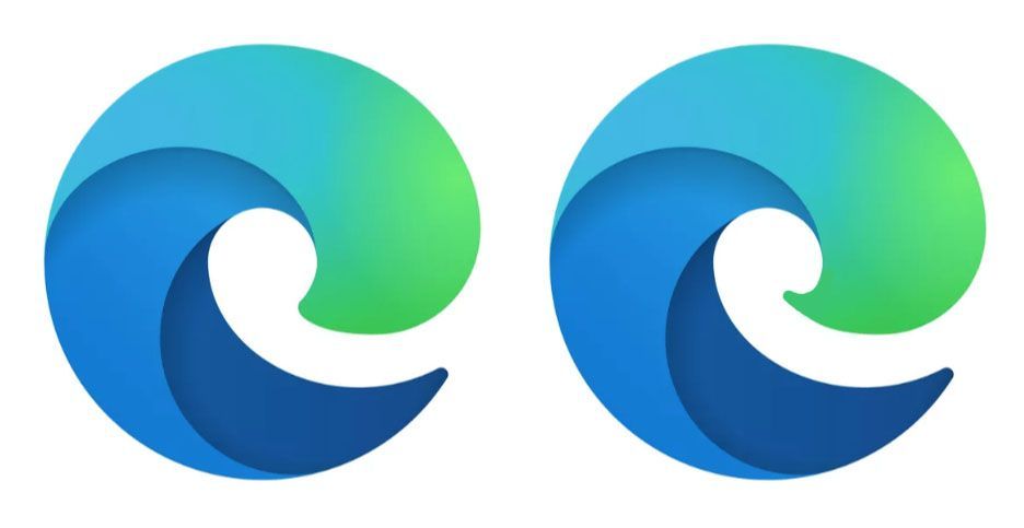
new logo looks terrible. I think current logo is better.
- Mark as New
- Bookmark
- Subscribe
- Mute
- Subscribe to RSS Feed
- Permalink
- Report Inappropriate Content
Nov 03 2019 01:08 AM
also it seems they put a hidden game inside the browser: edge://surf/
- Mark as New
- Bookmark
- Subscribe
- Mute
- Subscribe to RSS Feed
- Permalink
- Report Inappropriate Content
Nov 03 2019 01:44 AM
@Deleted It's true. The new logo looks terrible.
- Mark as New
- Bookmark
- Subscribe
- Mute
- Subscribe to RSS Feed
- Permalink
- Report Inappropriate Content
Nov 03 2019 01:58 AM
@HotCakeX actually, there's no 'edge' symbol in that new logo. it looks more like a slug or toothpaste on toothbrush.
- Mark as New
- Bookmark
- Subscribe
- Mute
- Subscribe to RSS Feed
- Permalink
- Report Inappropriate Content
Nov 03 2019 03:11 AM
- Mark as New
- Bookmark
- Subscribe
- Mute
- Subscribe to RSS Feed
- Permalink
- Report Inappropriate Content
Nov 03 2019 03:30 AM
@Deleted
This is horrid, gross & ugly as sin at 1st glance, but, I'll adjust (wink). Certainly, a solid departure from any reminder of Edge or IE... although, it ever so barely looks anything like an 'e', anymore. But, ok, it's quite artsy & distinctive. And the surfing (wave) idea sure is there & the colours are appropriate, (Windows) hues of blue & green , like the ocean, too; it's nice. It is prudent & timely to have it change(d). As a new Edge logo, sure, it will do just fine ![]()
Cheers,
Drew
- Mark as New
- Bookmark
- Subscribe
- Mute
- Subscribe to RSS Feed
- Permalink
- Report Inappropriate Content
Nov 03 2019 03:59 AM - edited Nov 03 2019 04:01 AM
@Deleted I dig the shape, the colors and the gradient. Sure, it doesn't look like an e very much anymore, but I don't think it has to. I really like it and look forward to it arriving in the Dev builds. The current logo is slightly outdated and doesn't fit with Microsoft's new icons very well.
- Mark as New
- Bookmark
- Subscribe
- Mute
- Subscribe to RSS Feed
- Permalink
- Report Inappropriate Content
Nov 03 2019 04:43 AM
The new logo is the first indication we've seen that Microsoft is developing a marketing campaign for Edge Chromium, and an innovative marketing campaign is essential if Microsoft intends to grow market share in the consumer market.
I like the logo (it has the modern, stylized look and feel of Firefox 70's logo and makes the Chrome logo look stodgy and outdated, to say the least) but I have to admit that the new logo is vaguely reminiscent of something I wouldn't want to step on if I were barefoot.
- Mark as New
- Bookmark
- Subscribe
- Mute
- Subscribe to RSS Feed
- Permalink
- Report Inappropriate Content
Nov 03 2019 04:59 AM
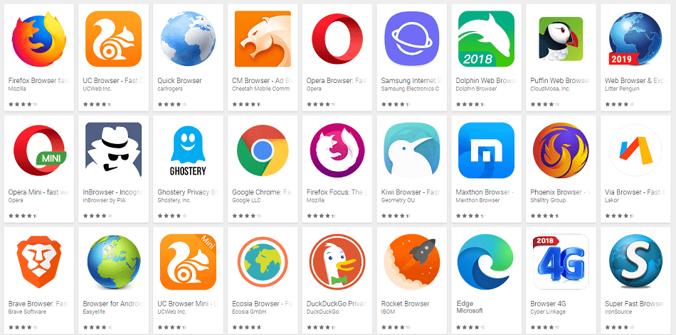
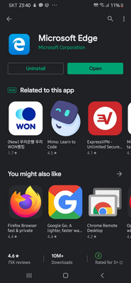
@Deleted As heir of Internet Explorer and Edge, it looks terrible and lost it's strict and definitive style, you even hardly can see e in this logo. But when you put it in play store it becomes not great, not terrible. Similar to Firefox and Opera. And I guess it was designed for this purpose.
- Mark as New
- Bookmark
- Subscribe
- Mute
- Subscribe to RSS Feed
- Permalink
- Report Inappropriate Content
Nov 03 2019 06:16 AM
- Mark as New
- Bookmark
- Subscribe
- Mute
- Subscribe to RSS Feed
- Permalink
- Report Inappropriate Content
Nov 03 2019 06:28 AM
@kevincrans Well I don't think so. I know their intention that design is for "Chromium" Edge, but there's no "edge" at all. I would prefer previous one.
- Mark as New
- Bookmark
- Subscribe
- Mute
- Subscribe to RSS Feed
- Permalink
- Report Inappropriate Content
Nov 03 2019 06:46 AM
- Mark as New
- Bookmark
- Subscribe
- Mute
- Subscribe to RSS Feed
- Permalink
- Report Inappropriate Content
Nov 03 2019 06:49 AM - edited Nov 03 2019 06:53 AM
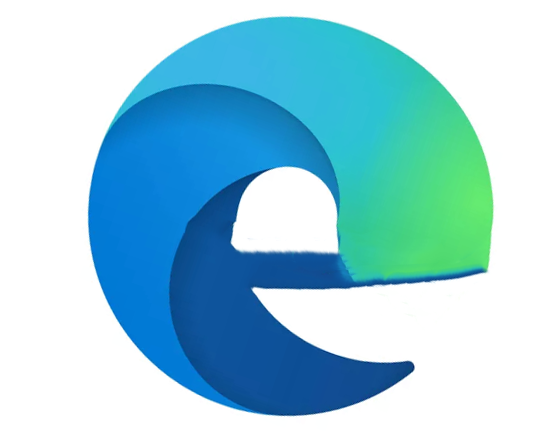
I do think it would look better with an halo above the left upper corner, where the back of it is visible in the middle finishing the shape of the e, I made a sketch.
- Mark as New
- Bookmark
- Subscribe
- Mute
- Subscribe to RSS Feed
- Permalink
- Report Inappropriate Content
Nov 03 2019 06:54 AM
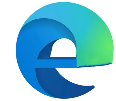
I also prefer a finished E logo like this.
don't mind the edges, just spent only few seconds on photoshop to make it look like a complete E shape
- Mark as New
- Bookmark
- Subscribe
- Mute
- Subscribe to RSS Feed
- Permalink
- Report Inappropriate Content
Nov 03 2019 06:56 AM
I like that idea, could look good in a 3d modeler
- Mark as New
- Bookmark
- Subscribe
- Mute
- Subscribe to RSS Feed
- Permalink
- Report Inappropriate Content
Nov 03 2019 06:59 AM
- Mark as New
- Bookmark
- Subscribe
- Mute
- Subscribe to RSS Feed
- Permalink
- Report Inappropriate Content
Nov 03 2019 07:07 AM
- Mark as New
- Bookmark
- Subscribe
- Mute
- Subscribe to RSS Feed
- Permalink
- Report Inappropriate Content
Nov 03 2019 07:11 AM
Dennis5mile
- Mark as New
- Bookmark
- Subscribe
- Mute
- Subscribe to RSS Feed
- Permalink
- Report Inappropriate Content
Nov 03 2019 07:14 AM - edited Nov 03 2019 07:19 AM
@Dennis5mile This indeed looked like a c to me upon first sight, so either the halo or the connection is essential.
- Mark as New
- Bookmark
- Subscribe
- Mute
- Subscribe to RSS Feed
- Permalink
- Report Inappropriate Content
Nov 03 2019 09:02 AM - edited Nov 04 2019 03:33 AM
SolutionUpdate (11/4):
Trade media articles suggest (as others in this thread have also suggested) that the design evokes surf -- ocean colors, wave shape, and so on -- and if that was the intent, the design does a very good job in that respect while maintaining a hint of "e".
Whatever was intended, the new logo is and will be the Edge logo going forward. It works well in many dimensions, and that is the defining characteristic of a good logo.
Original Comment (11/3):
My guess is that the meld between "c" and "e" is intentional, and tied into Microsoft's marketing plan.
I think that it is well done, even if my first nanosecond reaction was "a blue and green garden slug". It took me a second or two to see the logo for what it is, and it is a clever meld. I think that the logo conveys the Edge-Chromium message with panache.
But if you are concerned that the logo looks too much like a "c" rather than a "e", all that has to be done to correct that is to extend the middle loop a bit further. That would nudge it in the direction of an "e" while keeping the meld intact.
Accepted Solutions
- Mark as New
- Bookmark
- Subscribe
- Mute
- Subscribe to RSS Feed
- Permalink
- Report Inappropriate Content
Nov 03 2019 09:02 AM - edited Nov 04 2019 03:33 AM
SolutionUpdate (11/4):
Trade media articles suggest (as others in this thread have also suggested) that the design evokes surf -- ocean colors, wave shape, and so on -- and if that was the intent, the design does a very good job in that respect while maintaining a hint of "e".
Whatever was intended, the new logo is and will be the Edge logo going forward. It works well in many dimensions, and that is the defining characteristic of a good logo.
Original Comment (11/3):
My guess is that the meld between "c" and "e" is intentional, and tied into Microsoft's marketing plan.
I think that it is well done, even if my first nanosecond reaction was "a blue and green garden slug". It took me a second or two to see the logo for what it is, and it is a clever meld. I think that the logo conveys the Edge-Chromium message with panache.
But if you are concerned that the logo looks too much like a "c" rather than a "e", all that has to be done to correct that is to extend the middle loop a bit further. That would nudge it in the direction of an "e" while keeping the meld intact.


