- Home
- Microsoft Edge Insider
- Discussions
- Improvements to the context menu.
Improvements to the context menu.
- Subscribe to RSS Feed
- Mark Discussion as New
- Mark Discussion as Read
- Pin this Discussion for Current User
- Bookmark
- Subscribe
- Printer Friendly Page
- Mark as New
- Bookmark
- Subscribe
- Mute
- Subscribe to RSS Feed
- Permalink
- Report Inappropriate Content
Jul 12 2021 04:01 AM
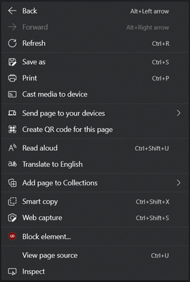
As updates goes by, the edge context menu is starting to become bigger and bigger.
I think there should be a settings page for the context menu, where you can enable or disable options for the context menu.
Another thing is that the context menu is really big on its own.
It should be resized, text size lowered and so on, basically made more compact.
- Mark as New
- Bookmark
- Subscribe
- Mute
- Subscribe to RSS Feed
- Permalink
- Report Inappropriate Content
Jul 13 2021 07:56 AM
There are 6 options from the context menu that I 100% don't use. They should let me disable them.
- Mark as New
- Bookmark
- Subscribe
- Mute
- Subscribe to RSS Feed
- Permalink
- Report Inappropriate Content
Jul 14 2021 03:08 AM
@Jerffelly Yeah, I've also suggested this before on here.
I'd like the right-click menu to be something like this:
Compared to the menu in your screenshot, here's the changes:
- Back, Forward and Refresh share one row, similar to Firefox's menu
- Options for Close tab and Reopen closed tab could be added
- Cast media to device: my current laptop is not capable of connecting to external displays wirelessly, so it's pointless me seeing this
- Send page to your devices: all my devices are treated as standalone, not networked
- Create QR code for this page: useful, sure, but I doubt the vast-majority of Edge users will have a need for this regularly (if at-all). And you can already click in the Address Bar to reveal the icon for it anyway
- Add page to Collections: I don't use the Collections feature, so have no-need for this. I've said before on here it would make-sense to only show this option after a user has created at-least one Collection first
- View page source and Inspect: I've no-idea why the Edge team continue to feel that the vast-majority of their users are Web Devs, who understand HTML, CSS, JavaScript and so-on... it's just one of those settings a typical end-user will accidentally click on then panic when something unfamiliar opens-up on the right. They really should add a setting to hide both these items, and have that setting on-by-default

