- Home
- Microsoft Edge Insider
- Discussions
- CONCEPT: Improving Edge's context / right click menu
CONCEPT: Improving Edge's context / right click menu
- Subscribe to RSS Feed
- Mark Discussion as New
- Mark Discussion as Read
- Pin this Discussion for Current User
- Bookmark
- Subscribe
- Printer Friendly Page
- Mark as New
- Bookmark
- Subscribe
- Mute
- Subscribe to RSS Feed
- Permalink
- Report Inappropriate Content
Sep 18 2020 02:21 PM
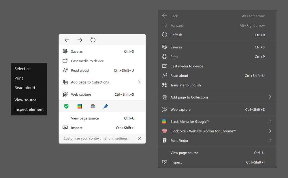
I think it's pretty safe to claim that the context menus in Edge are getting too big to work with effectively. For people who like using the navigation features, it can feel pretty disheartening to right click and see "back, forwards, refresh" appear halfway across the screen anyway. Additionally, it can be difficult to remember which options are part of the context menu and which are hidden away in Settings and More. In an attempt to highlight and address these issues, I came up with this concept:

Left: Edge Legacy's context menu. Center: my context menu concept. Right: Edge Canary's context menu.
My new context menu proposes two major improvements.
First, the menu cuts down on bulky elements by using the address bar versions of the navigation cluster and extensions. The horizontal navigation cluster is already such a staple of modern web browsers that I don't believe it would confuse anyone. Extensions are usually chosen by the user (or their company) so turning these into icons shouldn't cause any issues. These edits give the added (albeit unintentional) benefit of color coding the different sections. I find the whole menu easier to look through because the actual "contextual" part is bounded by two grey sections. Another benefit is, because the names of extensions are hidden, Microsoft can have complete control over the width of the menu. Finally, shrinking the navigation cluster to one line makes it more reasonable to incorporate into every context menu. Right now, right clicking an image, a link, or selected text will not make the navigation options appear, and this unreliability undercuts any usefulness the buttons had in the first place.
Second is the ability to "Customize your context menu in settings" as hinted by the dismissible bar under the menu. I see this as similar to the Customize Toolbar section of edge://settings/appearance . Many of the context menu items would be listed with toggle switches next to them. It (should be) easy to implement. Personally, I would turn off the "Print" and "Translate to English" options, which is why they are absent in the image above. I don't think any items should be hidden by default, and I don't think it should be possible to right click inside the right click menu to hide items. Some users might not know where to find the controls that make missing items reappear. (In other words, I want to lower the chance of having to explain it to my grandparents.) I also considered sorting the options into submenus, but forcing users to look through sub-menus sounded way worse than giving them the ability to customize the menu to their needs.
I spent way too much time on this thing, mostly fixing mistakes I made with the image, so thank you very much for reading through this whole post.
- Mark as New
- Bookmark
- Subscribe
- Mute
- Subscribe to RSS Feed
- Permalink
- Report Inappropriate Content
Sep 19 2020 03:36 AM
- Mark as New
- Bookmark
- Subscribe
- Mute
- Subscribe to RSS Feed
- Permalink
- Report Inappropriate Content
Sep 19 2020 05:25 AM
@WolfIcefang Excellent. I personally want a textless context menu, just click on read aloud icon and there you go.
- Mark as New
- Bookmark
- Subscribe
- Mute
- Subscribe to RSS Feed
- Permalink
- Report Inappropriate Content
Nov 13 2021 04:25 AM
@WolfIcefangWow! Your concept is super amazing. Hope Microsoft implements it soon
Why require a option for back, forward and refresh if they are already on toolbar
Even there's no need for refernece of shortcut keys really
- Mark as New
- Bookmark
- Subscribe
- Mute
- Subscribe to RSS Feed
- Permalink
- Report Inappropriate Content
May 07 2022 05:49 PM
- Mark as New
- Bookmark
- Subscribe
- Mute
- Subscribe to RSS Feed
- Permalink
- Report Inappropriate Content
May 08 2022 10:03 AM