Decrease White Space on Cards

Decrease White Space on Cards
3

Upvotes

Upvote

 Sep 16 2016
7 Comments (7 New)
Completed

There are several extra lines of white space on the cards for each post, this wastes a lot of screen space and causes execessive vertical scrolling.

The extensive use of empty lines, double line spacing and wide margins around containers makes for a very poor user experience on non-mobile devices.

The image below is all that I see on my very large monitor.
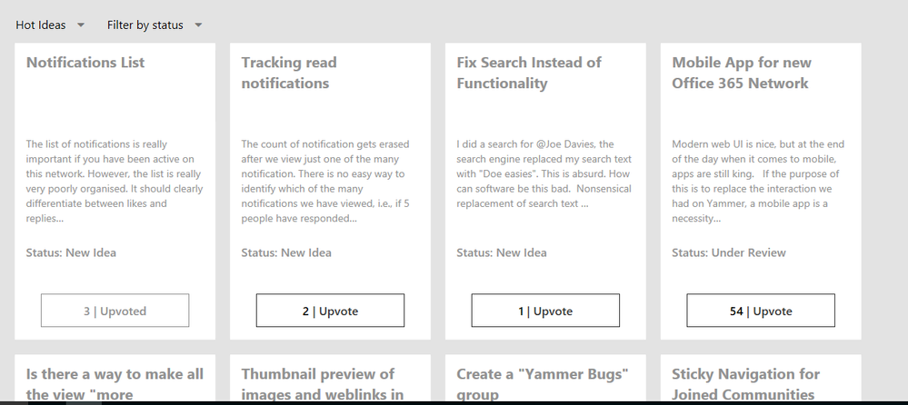
 

cads.png

Comments
Microsoft

This is to support longer subject lines.  You can see there are some ideas with longer subject lines to support this.

Silver Contributor

The title should wrap dynamically and the following text flow as necessary. Preseting a specific number of lines should not be necessary.

There is excess white space above the Upvote button that could be eliminated.

Microsoft
Status changed to: Under review
 
Former Employee
Status changed to: Planned
 
Community Manager

@Dean Gross

This is the old UI so I am going to go ahead and close this out as rolled out, let me know if you still feel there is some work to do here.


Allen

Community Manager
Status changed to: Completed
 
Community Manager
Status changed to: Completed