- Home
- Community Lounge
- Tech Community Discussion
- The new e-mail notifications not great on mobile device
The new e-mail notifications not great on mobile device
- Subscribe to RSS Feed
- Mark Discussion as New
- Mark Discussion as Read
- Pin this Discussion for Current User
- Bookmark
- Subscribe
- Printer Friendly Page
- Mark as New
- Bookmark
- Subscribe
- Mute
- Subscribe to RSS Feed
- Permalink
- Report Inappropriate Content
Apr 20 2021 11:02 PM - edited Apr 20 2021 11:02 PM
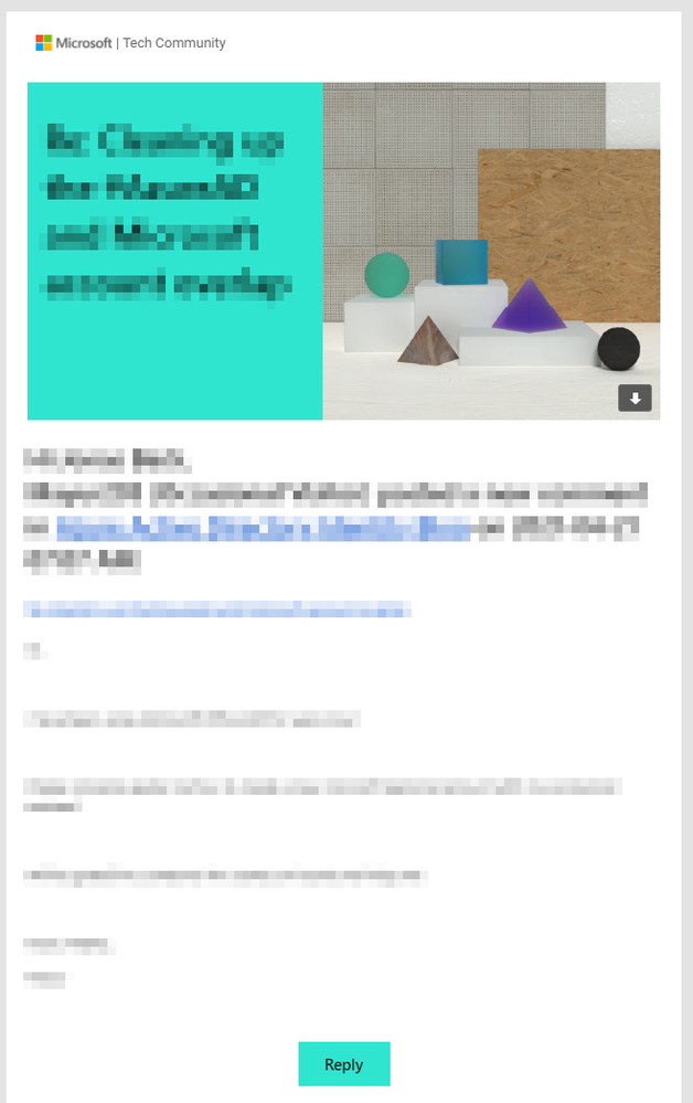
I noticed the design of the e-mail notifications of new posts in the Tech Community has changed. They look good on an ordinary Windows 10 client but when you open the same e-mail on a mobile device (in my case iOS running Outlook Mobile) you have to scroll down a few pages before you reach the actual e-mail content. I guess it needs some HTML tweaking.
Here's how it looks on a Windows 10 computer:
- Labels:
-
community
- Mark as New
- Bookmark
- Subscribe
- Mute
- Subscribe to RSS Feed
- Permalink
- Report Inappropriate Content
Apr 21 2021 05:14 AM
- Mark as New
- Bookmark
- Subscribe
- Mute
- Subscribe to RSS Feed
- Permalink
- Report Inappropriate Content
Apr 23 2021 01:46 PM
Desktop view is nice but not very practical as well. Even we don't need to scroll it's hard to find useful information in the middle of the screen. We shall train ourselves to ignore everything else more or less automatically.
