- Home
- Azure
- Azure Observability
- Re: Did Azure Alert Summary Page Change Format?
Did Azure Alert Summary Page Change Format?
- Subscribe to RSS Feed
- Mark Discussion as New
- Mark Discussion as Read
- Pin this Discussion for Current User
- Bookmark
- Subscribe
- Printer Friendly Page
Mar 25 2022
06:30 AM
- last edited on
Apr 08 2022
11:02 AM
by
TechCommunityAP
- Mark as New
- Bookmark
- Subscribe
- Mute
- Subscribe to RSS Feed
- Permalink
- Report Inappropriate Content
Mar 25 2022
06:30 AM
- last edited on
Apr 08 2022
11:02 AM
by
TechCommunityAP
Hello, I noticed that my Azure Alert summary page format has changed within the last week or so. Is this a known change, if so I can't seem to find any information on it. I would really like to change it back to the previous look and feel if possible. Any suggestions or thoughts would be greatly appreciated!
- Labels:
-
Azure Monitor
- Mark as New
- Bookmark
- Subscribe
- Mute
- Subscribe to RSS Feed
- Permalink
- Report Inappropriate Content
Mar 28 2022 09:26 AM
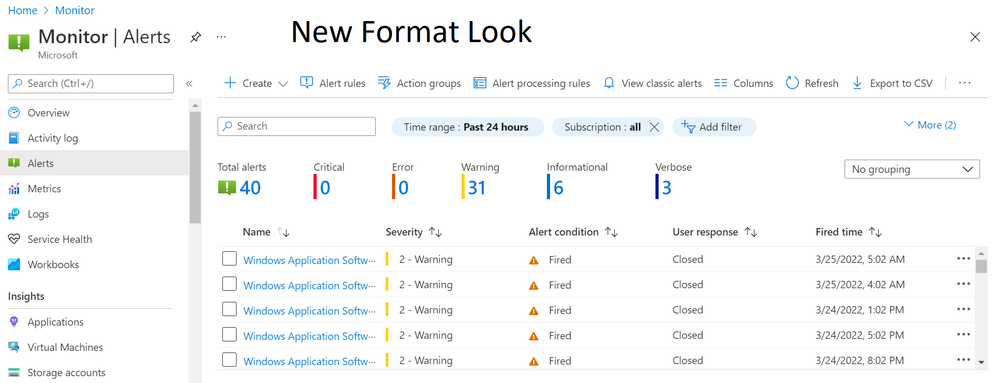
SolutionYes, the alerts summary page has changed recently. This is a result of an extensive usability study conducted around the alerts user experience, which surfaced several issues in the previous summary page. The new design focuses on the following aspects:
- When selecting "Alerts", you immediately see the list of fired alerts that require action. Previously, the summary page only provided a summation of data and counters, and an extra click was required to see the actual alerts.
- The summary blade is now focused on fired alerts. Previously, the total number of alerts included both fired and resolved alerts, which made it harder to identify how many alerts require attention.
- The terminology used in the page has been simplified, with terms that users found ambiguous like "Monitor condition" and "Alert state", replaced with "Alerts condition" and "User response" respectively.
Hope this helps clarify.
- Mark as New
- Bookmark
- Subscribe
- Mute
- Subscribe to RSS Feed
- Permalink
- Report Inappropriate Content
Mar 31 2022 12:43 PM
Thank you @Harel Broitman , though I do miss the ability to close large number of alerts at once, but I suppose I'll get use to the new format.
- Mark as New
- Bookmark
- Subscribe
- Mute
- Subscribe to RSS Feed
- Permalink
- Report Inappropriate Content
Mar 31 2022 12:50 PM
Part of the redesign also included moving to use a newer grid control, which currently doesn’t support the “select all” feature. We’re aware of that and planning to add this functionality back.
Accepted Solutions
- Mark as New
- Bookmark
- Subscribe
- Mute
- Subscribe to RSS Feed
- Permalink
- Report Inappropriate Content
Mar 28 2022 09:26 AM
SolutionYes, the alerts summary page has changed recently. This is a result of an extensive usability study conducted around the alerts user experience, which surfaced several issues in the previous summary page. The new design focuses on the following aspects:
- When selecting "Alerts", you immediately see the list of fired alerts that require action. Previously, the summary page only provided a summation of data and counters, and an extra click was required to see the actual alerts.
- The summary blade is now focused on fired alerts. Previously, the total number of alerts included both fired and resolved alerts, which made it harder to identify how many alerts require attention.
- The terminology used in the page has been simplified, with terms that users found ambiguous like "Monitor condition" and "Alert state", replaced with "Alerts condition" and "User response" respectively.
Hope this helps clarify.

