- Subscribe to RSS Feed
- Mark Discussion as New
- Mark Discussion as Read
- Pin this Discussion for Current User
- Bookmark
- Subscribe
- Printer Friendly Page
Apr 09 2021
05:55 AM
- last edited on
Apr 08 2022
10:45 AM
by
TechCommunityAP
- Mark as New
- Bookmark
- Subscribe
- Mute
- Subscribe to RSS Feed
- Permalink
- Report Inappropriate Content
Apr 09 2021
05:55 AM
- last edited on
Apr 08 2022
10:45 AM
by
TechCommunityAP
Hi!
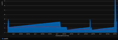
I am trying to create a graph to show the scaling of a Stream Analytics resource over time. I have log records at various points in time, when scale operations took place to a certain sku. When I render the graph, it shows lines incrementing or decrementing lines leading up to the next timestamp, but in this case that is not correct. The scale is the same number until the next scale operation takes place.
Is it possible to render a chart showing the exact value of the scaling, right up until the next scale operation takes place? The data now looks like this:
| 4/3/2021, 5:15:11.395 PM | 12 | ||
| 4/3/2021, 5:15:24.689 PM | 12 | ||
| 4/3/2021, 6:00:50.982 PM | 30 | ||
| 4/3/2021, 6:30:50.977 PM | 24 | ||
| 4/3/2021, 6:31:12.756 PM | 24 | ||
| 4/3/2021, 6:45:45.998 PM | 12 |
The graph in blue, and in red how the lines should be.

- Labels:
-
Azure Monitor
-
Query Language