- Home
- Azure
- Azure Observability
- Are horizontal bar graphs possible in Log Analytics/Azure monitor?
Are horizontal bar graphs possible in Log Analytics/Azure monitor?
- Subscribe to RSS Feed
- Mark Discussion as New
- Mark Discussion as Read
- Pin this Discussion for Current User
- Bookmark
- Subscribe
- Printer Friendly Page
Jul 29 2020
02:10 PM
- last edited on
Apr 08 2022
10:34 AM
by
TechCommunityAP
- Mark as New
- Bookmark
- Subscribe
- Mute
- Subscribe to RSS Feed
- Permalink
- Report Inappropriate Content
Jul 29 2020
02:10 PM
- last edited on
Apr 08 2022
10:34 AM
by
TechCommunityAP
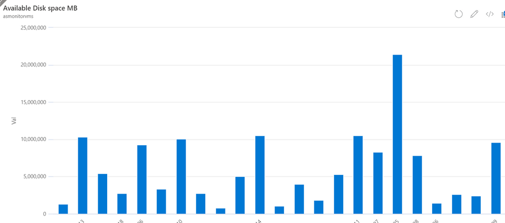
I'd like to have Computers as values on the y-axis and Mb on the on the x-axis in terms of free disk space available. I haven't been able to find any examples on the web using Azure Monitor.

InsightsMetrics
| where Name == "FreeSpaceMB"
and TimeGenerated > ago(10m)
- Labels:
-
Azure Monitor
-
Query Language
- Mark as New
- Bookmark
- Subscribe
- Mute
- Subscribe to RSS Feed
- Permalink
- Report Inappropriate Content
Jul 30 2020 01:56 AM
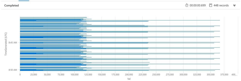
SolutionGo to Log Analytics and run query
InsightsMetrics
| where Name == "FreeSpaceMB"
and TimeGenerated > ago(10m)
| render barchart kind=stacked
https://docs.microsoft.com/en-us/azure/data-explorer/kusto/query/renderoperator?pivots=azuremonitor
A better example would be (please adapt)
InsightsMetrics
| where Name == "FreeSpaceMB"
and TimeGenerated > ago(10m)
| summarize sum(Val) by Computer
| render barchart kind=stacked- Mark as New
- Bookmark
- Subscribe
- Mute
- Subscribe to RSS Feed
- Permalink
- Report Inappropriate Content
Jul 30 2020 05:06 AM
@CliveWatson Thank you soooo much! This really helped.
- Mark as New
- Bookmark
- Subscribe
- Mute
- Subscribe to RSS Feed
- Permalink
- Report Inappropriate Content
Aug 03 2020 07:12 AM
Hi @Jhilene
For full documentation on rendering options see this: https://docs.microsoft.com/en-us/azure/data-explorer/kusto/query/renderoperator?pivots=azuremonitor
Thanks,
Meir
- Mark as New
- Bookmark
- Subscribe
- Mute
- Subscribe to RSS Feed
- Permalink
- Report Inappropriate Content
Aug 05 2020 10:13 AM
@Meir Mendelovich Thank you!
Accepted Solutions
- Mark as New
- Bookmark
- Subscribe
- Mute
- Subscribe to RSS Feed
- Permalink
- Report Inappropriate Content
Jul 30 2020 01:56 AM
SolutionGo to Log Analytics and run query
InsightsMetrics
| where Name == "FreeSpaceMB"
and TimeGenerated > ago(10m)
| render barchart kind=stacked
https://docs.microsoft.com/en-us/azure/data-explorer/kusto/query/renderoperator?pivots=azuremonitor
A better example would be (please adapt)
InsightsMetrics
| where Name == "FreeSpaceMB"
and TimeGenerated > ago(10m)
| summarize sum(Val) by Computer
| render barchart kind=stacked