- Home
- Microsoft Edge Insider
- Articles
- Vertical tabs preview now available in the Canary and Dev channels
Vertical tabs preview now available in the Canary and Dev channels
- Subscribe to RSS Feed
- Mark Discussion as New
- Mark Discussion as Read
- Pin this Discussion for Current User
- Bookmark
- Subscribe
- Printer Friendly Page
- Mark as New
- Bookmark
- Subscribe
- Mute
- Subscribe to RSS Feed
- Permalink
- Report Inappropriate Content
Oct 27 2020 09:47 AM - last edited on Oct 27 2020 02:08 PM by Deleted
Tomorrow, we’re releasing an early preview of vertical tabs in Microsoft Edge. This feature, which is now available in the Canary and Dev channels, allows you to find and manage large numbers of tabs quicker and easier than ever before.
Many of you we’ve spoken with have expressed difficulties with managing more than a few open tabs. It’s easy to open dozens of tabs while shopping or researching online, and it’s not uncommon to leave tabs open as a reminder for later—sometimes for days or weeks at a time. As more tabs are opened, it can become difficult to see which tab is which. And eventually you run out of room for new tabs altogether.
If this sounds familiar, we suggest trying out vertical tabs. This layout preserves space for all your tabs, so that you can easily see and scan the tab titles. Managing them from this layout is also easier, with a more intuitive interface for things like drag and drop.
Wide screens have become the norm over the last decade or so, but most websites are still designed with a narrower width that leaves unused space on either side of the content. Vertical tabs takes advantage of this unused space to show you more of your tabs without sacrificing how much content you can see at once. And with the ability to scroll through your tabs, you’re free to open as many as you want.
Your tabs, your way
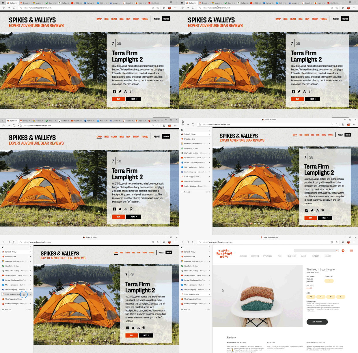
Getting started is easy. Just click the vertical tabs icon 

Get the most out of your tabs
Vertical tabs also makes it easier than ever to manage your tabs. Here’s a few things you can try:
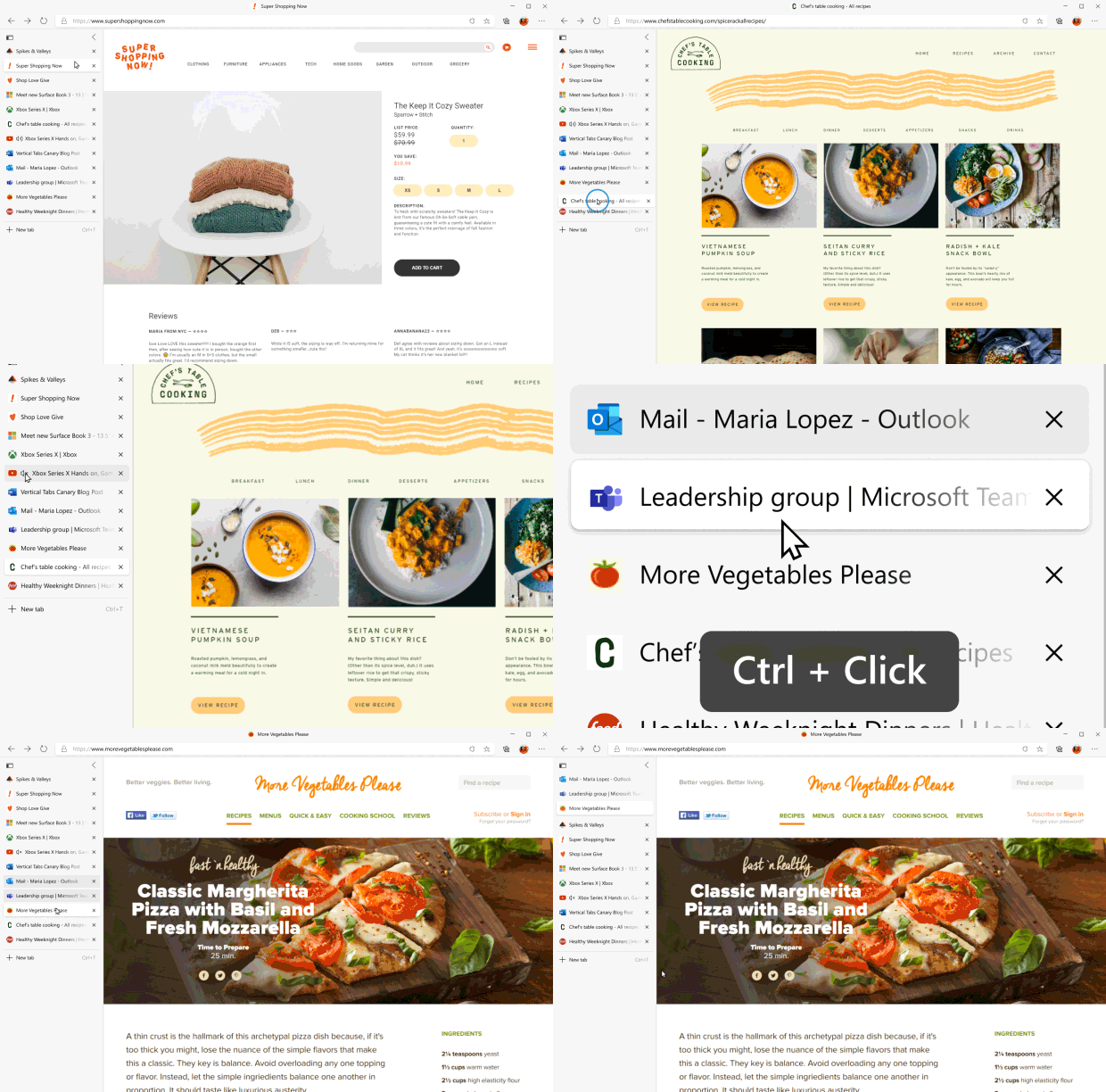
- Reorder and manage multiple tabs at once: Select multiple tabs at once by holding down either Ctrl or Shift and clicking on the tabs you want to manage. From here, you can reorder the tabs, drag them into a new window, or even close, refresh, duplicate, pin, or mute them all at once.
- Mute noisy tabs: Quickly silence tabs playing audio in the background by clicking on the speaker icon
. This makes it easy to mute noisy tabs without leaving the tab you’re on.
- Pin your favorite tabs: Do you frequently rely on certain websites? Right-click on the tab and select pin
to move it to a dedicated section at the top of the tab list so the site is always just a click away. Edge will even remember your pinned tabs across browser sessions
See more of the web
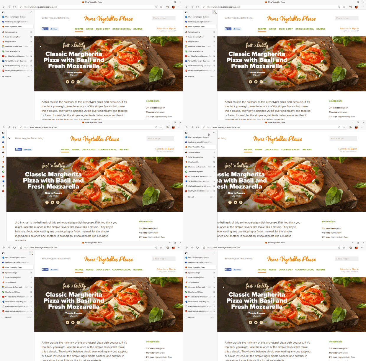
Of course, sometimes you need to focus on just the tab in front of you. Or maybe you’re on a device with a smaller screen. Simply click the collapse icon 
Click on one of the tab previews to instantly switch tabs, or hover your mouse over the collapsed pane to see the full tab info. Of course, you can always pin the pane open again at any time by hovering over the sidebar and selecting the pin button 
Send us feedback
This is just the beginning of vertical tabs, and we’d love to hear what you think of the new experience. Please send us feedback if something isn’t working right. And if there’s a feature you’d like to see added to vertical tabs, we’re excited to hear that too.
Thanks for being part of this early preview! We look forward to hearing your feedback.
— William Devereux, Senior Program Manager, Microsoft Edge
— Jerin Schneider, Principal Program Manager, Microsoft Edge
- Mark as New
- Bookmark
- Subscribe
- Mute
- Subscribe to RSS Feed
- Permalink
- Report Inappropriate Content
Nov 04 2020 12:39 PM
@William Devereux Loved vertical tabs, but can we have reverse ordering as an option? Not only does it make noticing tab loading and new tab opening much easier (at top always same position), if the + button can be at the top as well then it would make better muscle memory for opening new tab with mouse operation.
- Mark as New
- Bookmark
- Subscribe
- Mute
- Subscribe to RSS Feed
- Permalink
- Report Inappropriate Content
Nov 04 2020 12:53 PM
@William Devereux I think they are a great start, although there are a few things that could be improved.
· the title bar now takes up all the space that used to be consumed by the tabs, this is unfortunate as I was really looking forward to gaining more vertical page space by using vertical tabs
· the NewTab button is at the bottom of the list and therefore moves constantly - putting it at the top would have meant there was always a single place to click for a new tab.
· the tab bar isn't resizable - it would be nice to be able to expand it sometimes to read more of the tab titles.
· there is no visual link between the current tab and the displayed page
· it's weird that the back button is now to the left of the tabs.
A (very)rough mockup of what I was hoping for would be something like this:
I do love the ability to "pin" tabs though, that's going to be great :D
- Mark as New
- Bookmark
- Subscribe
- Mute
- Subscribe to RSS Feed
- Permalink
- Report Inappropriate Content
Nov 05 2020 04:27 AM
@jateruy, yes, an option to flip the order would be nice. I agree.
- Mark as New
- Bookmark
- Subscribe
- Mute
- Subscribe to RSS Feed
- Permalink
- Report Inappropriate Content
Nov 05 2020 04:38 AM
@dgkimpton, I think I disagree with most of these (but not strongly). Certainly, I have nothing against them being options, but to give MS alternative feedback on these:
1. The title bar already narrows SLIGHTLY (admittedly, not enough to really add any screen real estate to the page). I'm OK with it shrinking a bit more, but I do think it's important to keep an area at the top for easily grabbing the window to drag and move it.
2. The new tab button for horizontal tabs is always at the right end and already moves based on the number of tabs. I think the vertical tab button should follow that for consistency.
3. Resizeable pane for tabs -- I'm neutral on this one. There are times when I would like to make it wider or narrower to see more of the text or make the window narrower, but I also appreciate that it maintains a consistent width. If it had the ability to change its width, I'd use it. Maybe consider how this works in the Outlook application -- it is possible to resize the panes, but only within a fairly minor range.
4. No visual link between the current tab and the displayed page -- Yes there is. At least for me, the current tab is highlighted. Maybe this is a bug if it's not for everyone?
5. Weird that back button is to left of tabs -- I definitely don't think this should change. The button positions at the top of the window should remain as they are for consistency.
Good UI innovations should never break consistency. Consistency is most important in UI, so any improvements should always ensure consistency is maintained. That doesn't mean UI can't evolve and improve (they definitely should), just that any changes must be holistic to preserve UI consistency.
- Mark as New
- Bookmark
- Subscribe
- Mute
- Subscribe to RSS Feed
- Permalink
- Report Inappropriate Content
Nov 05 2020 05:02 AM
@Colin - 1. in the mockup I did leave a couple of pixels for dragging (exactly the same as in the current Edge when you have lots of tabs open in fact), I absolutely agree that losing that ability would suck outrageously. I don't see any great value in having the document title up there though - in horizontal-mode, we don't have it either. I assume they put the title there because the min/max/restore icons were already there and just leaving a giant empty space would look weird.
2. Strangely being at the end in horizontal mode never bothered me, but being at the bottom just feels continuously irritating. I'd got as far as to say I in fact expect newly opened tabs to appear at the top of the list too - just something about my mental model of a stack I guess.
4. The tab is highlighted, but not linked to the main window - in horizontal mode, there is a clear indication that the highlighted tab also links to the window. This is, admittedly, a very minor issue.
5. We're just going to have to disagree here - I don't believe consistency (especially between modes that won't be used at the same time) is that paramount. Daily workflow and visual comprehensibility are way more important than being consistent for the sake of it. That's not to say consistency is unimportant, just that it definitely doesn't come so high up my list.
- Mark as New
- Bookmark
- Subscribe
- Mute
- Subscribe to RSS Feed
- Permalink
- Report Inappropriate Content
Nov 05 2020 11:52 PM
usually when closing a tab by clicking on X and opening a new tab by clicking on +.
I never have problem with vertical tabs side panel staying open for too long, but always have problem with the side panel closing/retracting too soon.
- Mark as New
- Bookmark
- Subscribe
- Mute
- Subscribe to RSS Feed
- Permalink
- Report Inappropriate Content
Nov 06 2020 03:49 AM
@HotCakeX The animation choice is definitely weird, and that is at least one of the factors that make vertical tabs annoying.
When you hover over the vertical tab strip it expands with animation, then, to get rid of the expanded tabs you have to bring the cursor outside of the expanded area and then it retracts with no animation whatsoever. It closes with a jerk. This inconsistency makes it a headache.
It doesn't even need to expand if you just want to switch to another tab but it still does, so tab strip is in itself essentially useless, it just shows you the website favicons.
I suggest new tab to be a + protruding out of the tab strip, you can open a new tab this way without any animation.
Additional thought : to close a tab you have go to the left hand side of the screen, move the cursor to (for reaching the tab strip) and fro to click on x, closing a window requires you to just bring the cursor to right edge corner and click x. If vertical tabs were on right side all the xs would fall on the same one line.
- Mark as New
- Bookmark
- Subscribe
- Mute
- Subscribe to RSS Feed
- Permalink
- Report Inappropriate Content
Nov 06 2020 05:13 AM
@cheeseleader, I do get slide in and out animation on open and close respectively. They occur at the same speed for me. Interesting that you don't get that. Sounds like a bug you are experiencing. Please be sure to log that as feedback through the Feedback option in Edge (Alt-Shift-I). If it's a rare issue, MS may not be aware.
- Mark as New
- Bookmark
- Subscribe
- Mute
- Subscribe to RSS Feed
- Permalink
- Report Inappropriate Content
Nov 06 2020 06:31 AM
I think the placement is good on the left side, almost all browsers, when decide to implement a sidebar, put it on the right side, for no reason!
left or right, there is no difference, me as a user am not more inclined to move my mouse cursor to the right side of the screen.
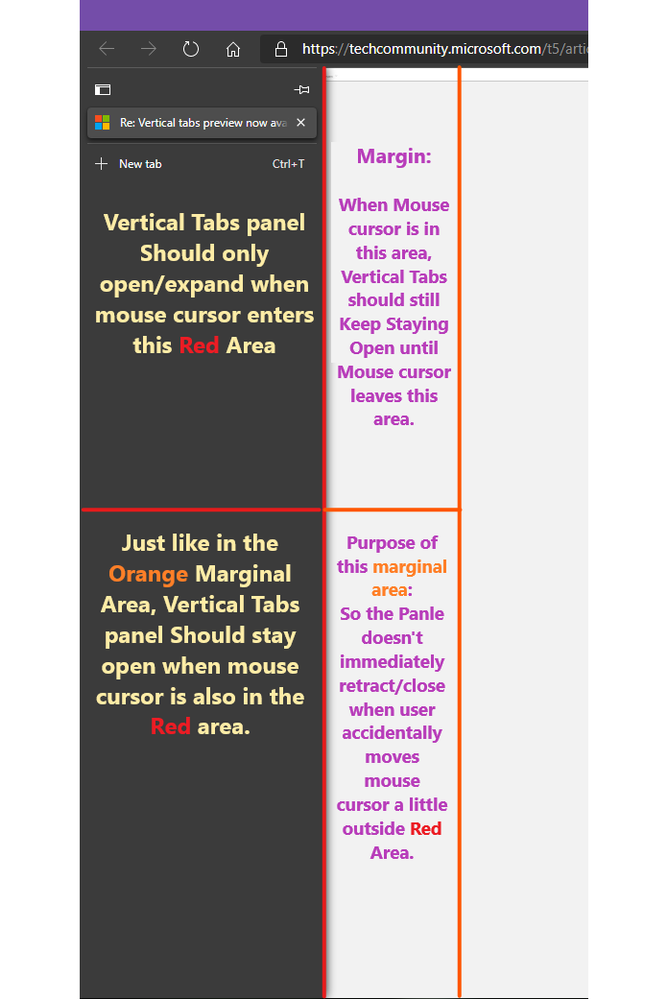
they just have to tweak the areas where mouse cursor can close/open Vertical tabs panel.
like keep the panel always open when mouse cursor is inside, and also specify a margin like this.
Used Paint 3D app in Windows 10
I do have animation on closing/opening. Edge Dev Version 88.0.685.3
- Mark as New
- Bookmark
- Subscribe
- Mute
- Subscribe to RSS Feed
- Permalink
- Report Inappropriate Content
Nov 06 2020 01:49 PM
First, the already mentioned X to close. It would be very ergonomic if the favicon transformed into the X when hovered, enabling the user to close a tab even before the full sidebar animation ends (I do realize that this would probably conflict with the speaker icon, don't know exactly how to integrate both).
Second, the + icon to add a new tab shouldn't trigger the drawer animation. As a user, I don't really need more information when opening a new tab. The plus sign is enough, I don't need to search or gather anything about it. Making it static would also reduce the total amount of times one sees it while browsing thus reducing the impact for the people who found it "annoying" or "distracting" reducing.
- Mark as New
- Bookmark
- Subscribe
- Mute
- Subscribe to RSS Feed
- Permalink
- Report Inappropriate Content
Nov 07 2020 03:46 AM
- Mark as New
- Bookmark
- Subscribe
- Mute
- Subscribe to RSS Feed
- Permalink
- Report Inappropriate Content
Nov 07 2020 07:42 AM
@xhx2218 wrote:
您的帐户已被标记。 因此,您的个人资料被隐藏在公众中。如果您认为这是一个错误,请联系支持人员,以检查您的帐户状态。
Your account has been tagged. As a result, your personal data is hidden from the public. If you think this is an error, contact support to check the status of your account.
Try to post a screenshot of the error message and where you see it
- Mark as New
- Bookmark
- Subscribe
- Mute
- Subscribe to RSS Feed
- Permalink
- Report Inappropriate Content
Nov 10 2020 02:45 PM
@William Devereux Vertical tabs is so useful but the problem is a new windows top title bar appears when you enable vertical tabs. I assume it is to cater for the standard windows minimize, maximize and close buttons.
The new top title bar is also distracting as it has a loading icon next to it as well as it takes to much free space.
I use edge and another app side by side. However the top bar is so distracting I just want a way to get it gone. You can autohide it in fullscreen mode (F11) but I use windowed mode with two windows side by side.
if vertical tabs are enabled it would be great to have any temporary solution so that the top title bar is not visible. Possible solutions are
- If one could hide the top bar in window mode just like you can hide it in fullscreen mode
- If one can hide the address bar. Just like you can hide bookmark bar in settings. That might make the title bar more bearable.
- The loading icon not show in window top bar but show on the vertical tab current window icon instead.
Edge vertical tabs would be so useful if there was an experiment just to hide the top title bar when in window mode.
Why is it that you don't have to view the window title when using horizontal tabs? But when vertical tabs are introduced suddenly you are forced to see the long window title. The window title just feels out of place like it doesn't belong and is distracting. That is why it is not there with horizontal tabs.
Please make a way to remove the top window title bar in vertical tab mode. (not just in fullscreen mode but in windowed mode) Even if just an experiment that would be great. I use keyboard shortcuts anyway.
here is an example of firefox hiding the top title bar
https://itsfoss.com/remove-title-bar-firefox/
- Mark as New
- Bookmark
- Subscribe
- Mute
- Subscribe to RSS Feed
- Permalink
- Report Inappropriate Content
Nov 10 2020 05:03 PM
@devfric, the title bar is important to be able to grab and move (drag) the window. Perhaps it could be shorter, but it shouldn't go away or you lose the window drag handle. That should remain big enough that someone who is not an Edge expert doesn't have a hard time clicking in it.
- Mark as New
- Bookmark
- Subscribe
- Mute
- Subscribe to RSS Feed
- Permalink
- Report Inappropriate Content
- Mark as New
- Bookmark
- Subscribe
- Mute
- Subscribe to RSS Feed
- Permalink
- Report Inappropriate Content
Nov 13 2020 03:21 AM
@William Devereux Its a nice feature, however on my main screen I have the task bar on the left hand side, then Edge has its vertical tabs, and in Edge I'm looking at outlook.com, with a list of emails on the left, so three vertical stacks stuffed against the left. It would be nice to have a little more contrast for the tab stack - just a few pixels margin to the right of the drop shadow. I know contrast has gone out of fashion, and "users expect" flat buttons, text with no indication of a hyperlink etc, but this user is old school.
Secondly, when I have a whole bunch of tabs open, sleeping or not, it would be nice to have a "close this tab" button on the address bar, so I don't have to open the stack and find the active tab on the list.
Finally, you must check that functions that work when the mouse hovers still work on tablets like Surface, they don't see my finger hovering.
BTW If I set the task bar to auto hide, it rolls away left and doesn't come back (I have three screens, so the mouse just goes to the next screen, rather than revealing the task bar) I guess that's a bug with the task bar though.
- Mark as New
- Bookmark
- Subscribe
- Mute
- Subscribe to RSS Feed
- Permalink
- Report Inappropriate Content
Nov 13 2020 09:30 PM
- Mark as New
- Bookmark
- Subscribe
- Mute
- Subscribe to RSS Feed
- Permalink
- Report Inappropriate Content
Nov 15 2020 09:22 AM
@rjtiwari10 I'd also like to see a dialog when I click the X of the main bowser window, if I have more than one tab open, it should ask "Close the current tab or all tabs" like Adobe does with pdfs.
- Mark as New
- Bookmark
- Subscribe
- Mute
- Subscribe to RSS Feed
- Permalink
- Report Inappropriate Content
Nov 20 2020 09:09 PM
@William Devereux can top bar can be hidden during verticle tab mode? It would save some monitor space. The top bar can reappear when the mouse hovers on it. Thank you.
- Mark as New
- Bookmark
- Subscribe
- Mute
- Subscribe to RSS Feed
- Permalink
- Report Inappropriate Content
Dec 14 2020 10:21 PM
@William Devereux This looks awesome. BTW, may I ask what software was used to create these GIFs? They look really neat!


