- Home
- Microsoft Edge Insider
- Articles
- Introducing the new favorites experience in Microsoft Edge
Introducing the new favorites experience in Microsoft Edge
- Subscribe to RSS Feed
- Mark Discussion as New
- Mark Discussion as Read
- Pin this Discussion for Current User
- Bookmark
- Subscribe
- Printer Friendly Page
- Mark as New
- Bookmark
- Subscribe
- Mute
- Subscribe to RSS Feed
- Permalink
- Report Inappropriate Content
Oct 14 2020 10:00 AM - edited Oct 14 2020 10:04 AM
Favorites are an integral part of any web browser, and in the months since we released the new version of Microsoft Edge we’ve heard a lot of feedback about the experience. Specifically:
- While the favorites menu provides quick access to your favorites, it isn’t always the easiest to use and more complex tasks typically require going to the edge://favorites page
- The favorites page works well for bulk management but isn’t ideal for more lightweight tasks like getting to, updating, or moving a single favorite
- Many of you also miss the Hub in the legacy version of Microsoft Edge—especially the ability to pin your favorites and other content open while you browse
Today, we’re excited to share that we’re evolving the favorites experience to address your feedback and provide a more efficient way for you to quickly access and manage your favorites without losing context of the page you’re on. These changes are currently available in the Canary and Dev channels.
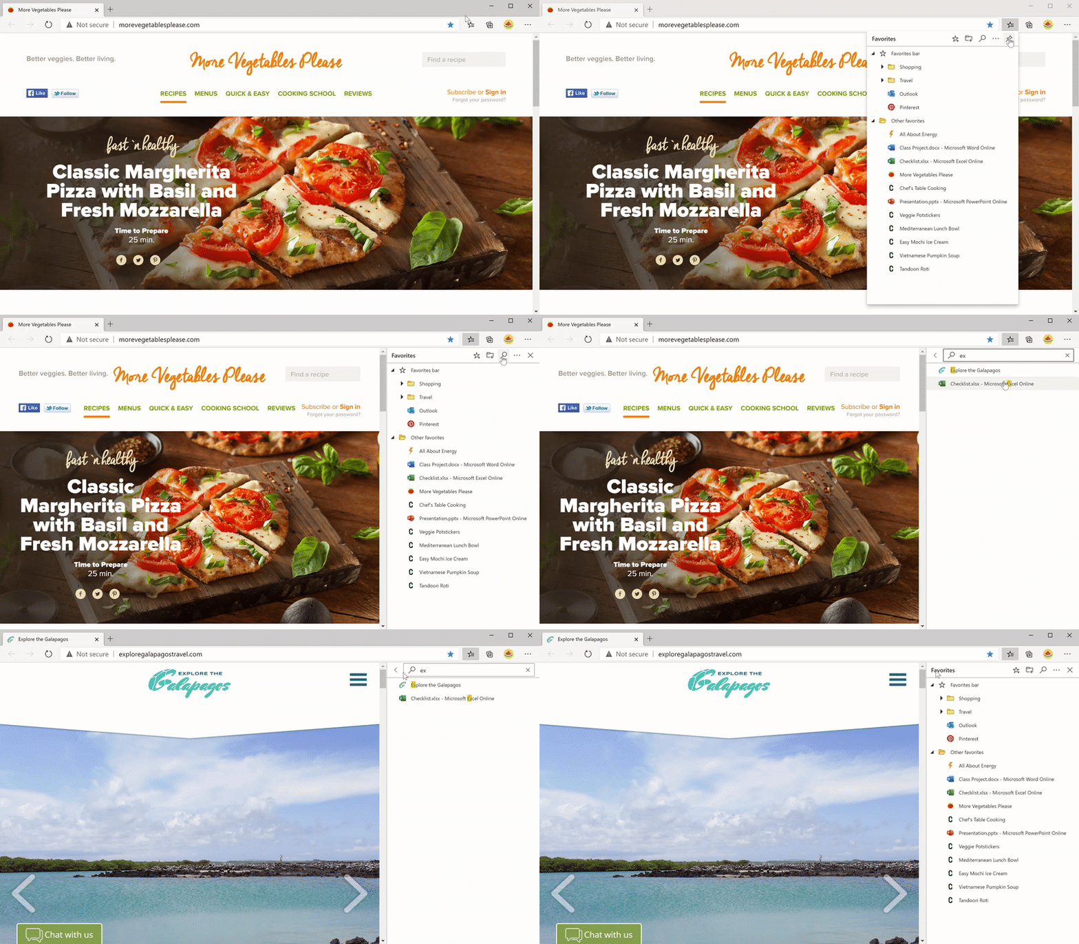
The new favorites experience blends the power of the full page with the dropdown’s ease of access. Your favorites are now displayed in a classic tree view, and you can edit, organize, and even search your favorites in-line without having to go to the full page. The new favorites menu stays around while you need it and disappears when you’re done, making it easy to open or manage multiple favorites at once.
We’ve also brought the full breadth of management capabilities to the new favorites menu. In addition to the basics like reordering, renaming, and editing, you can now add new favorites and folders directly from the dropdown menu, sort, import or export your favorites, remove duplicate items, and much more. With the new favorites menu, these features are always at your fingertips.
Best of all, in response to overwhelming feedback you can now pin your favorites open in a pane along the side of the browser. This allows you to see your favorites while you browse and helps you stay more productive during those times where you need frequent access to your favorites.
For those of you who prefer a more immersive experience, we’ve got you covered. You can get back to the favorites page at any time by clicking on the favorites menu button (
We’d love to hear what you think of the new favorites experience, so please send us feedback! This is a new interaction model that we hope will save you time and keep you in the context of what you’re doing. In the coming months, you’ll see other content types adopt this model as well, including downloads, history, and more. Stay tuned!
— William Devereux, Senior Program Manager, Microsoft Edge
- Mark as New
- Bookmark
- Subscribe
- Mute
- Subscribe to RSS Feed
- Permalink
- Report Inappropriate Content
Oct 17 2020 12:28 AM
@Noel Burgess Agree the space between favorites can be reduced. It would be great to have a bigger space for the folders.
- Mark as New
- Bookmark
- Subscribe
- Mute
- Subscribe to RSS Feed
- Permalink
- Report Inappropriate Content
Oct 17 2020 12:54 AM
@William Devereux Pin Favourites is great to have them right where you need them, on the side of this very wide pages (16:9 screens all around us) just a couple of fixes:
- once I pin the favourites I would like them to stay pinned for next time I open them (ala collections)
- the pinned favourites page should be width resizable.
Keep up the good work, great browser you are building
- Mark as New
- Bookmark
- Subscribe
- Mute
- Subscribe to RSS Feed
- Permalink
- Report Inappropriate Content
Oct 17 2020 01:15 AM
@Claudiox wrote:space between favorites can be reduced.
on the contrary I think the spacing between favorites and folders are just perfect. it's useful to have this amount of space, easier to use with mouse. they got it right, don't need to change this part of it.
the only thing is to make the Pin state remembered and also make the favorites menu faster to appear.
- Mark as New
- Bookmark
- Subscribe
- Mute
- Subscribe to RSS Feed
- Permalink
- Report Inappropriate Content
Oct 17 2020 03:46 PM
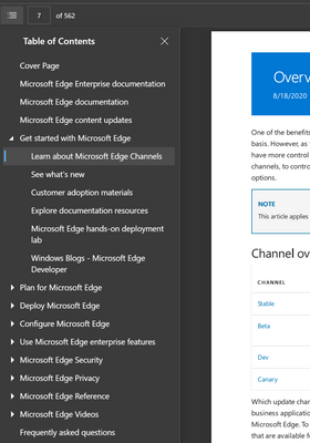
@William Devereux Please support pinning the favorites panel on the left. For content that looks and feels like a table of contents or an index, I prefer it to be pinned on the left not the right. From my perspective, this is not unlike how the PDF viewer in Edge now exposes a table of contents, on the left, at least for LTR languages. I would use my favorites similarly.
While on the subject, I would prefer the same for the collections sidebar.
Curiously, the dev tools supports the option to pin to either side so it shouldn't be difficult to support this for other pinned content.
I would accept that collections and favorites may share a right or left side setting since these do not coexist. That too is puzzling since collections/favorites can coexists with a sidebar search and devtools with three simultaneously pinned panels. My screen isn't wide enough for this but it is curious that collections and favorites couldn't coexist with each other like that both do with the others.
- Mark as New
- Bookmark
- Subscribe
- Mute
- Subscribe to RSS Feed
- Permalink
- Report Inappropriate Content
Oct 17 2020 04:03 PM - edited Oct 17 2020 04:07 PM
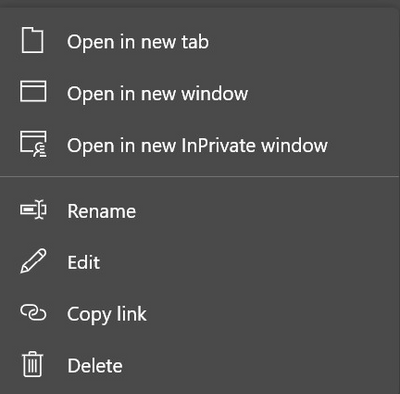
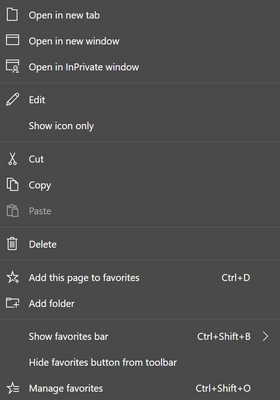
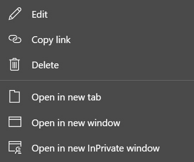
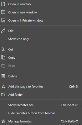
@William Devereux Do you plan to fix the wildly inconsistent menus both in the titles of the menu items and in the order. Here are some differences
Favorite in New Favorites Menu & Sidebar
Favorite in Favorites Bar
Favorite in Manage Favorites (edge://favorites/)
Favorite in Old (86.0.622.43) Favorites Menu
As you can see, the current favorites bar menu matches the old favorites menu. With some small exceptions, I expect all of these to be the same,
There are also functional differences between the Copy/Copy link menu behavior, not the UI difference of name, but with what is placed on the clipboard.
Also note that the favorites bar menu still lists Ctrl+Shift+O as the hotkey for Manage Favorites. While this now brings up the new favorites menu, it definitely isn't the much more function manage favorites UI at edge://favorites/ which either no longer has a hotkey or has an undocumented one.
See Re: Announcing a new way to paste URLs, Link format! - Page 3 - Microsoft Tech Community for more on the clipboard functionality differences.
- Mark as New
- Bookmark
- Subscribe
- Mute
- Subscribe to RSS Feed
- Permalink
- Report Inappropriate Content
Oct 18 2020 03:11 AM
@William Devereux The new bookmark system is a great solution. There is only one thing that should be changed, and that is to remove "Other Favorites" from the favourites bar. Or at least give you the option to disable showing them.
- Mark as New
- Bookmark
- Subscribe
- Mute
- Subscribe to RSS Feed
- Permalink
- Report Inappropriate Content
Oct 18 2020 11:24 AM
@Mitchris wrote:... remove "Other Favorites" from the favourites bar.
If the Other favorites folder is empty, it won't show on the favorites bar. Open edge://favorites/?id=2. Creae a new folder wherever you like and move the contents of Other favorites (that's the folder with id=2) into it.
- Mark as New
- Bookmark
- Subscribe
- Mute
- Subscribe to RSS Feed
- Permalink
- Report Inappropriate Content
Oct 19 2020 02:59 AM
We really need favorites bar to Android version too. on horizontal mode, the browser can work just like it would on real desktop, so please add option to keep the bar always visible. we tablet users really need it.
or make option "real desktop mode", where sites and the ui works on desktop mode, include the always visible favs bar.
- Mark as New
- Bookmark
- Subscribe
- Mute
- Subscribe to RSS Feed
- Permalink
- Report Inappropriate Content
Oct 19 2020 06:43 AM - edited Oct 19 2020 06:45 AM
Bonjour,
Malheureusement, depuis que Edge Chromium est sorti, il y a toujours le même problème, déjà remonté plusieurs fois: lors d'un Ctrl+clic ou d'un clic sur le bouton du milieu de la souris, pour ouvrir un Favori dans un nouvel onglet depuis le Panneau des Favoris, le panneau se ferme!
Cela n'arrive pas avec la barre des Favoris, mais comme je préfère utiliser le bouton à côté de la barre d'adresse (qui ouvre le panneau des Favoris), ce serait bien si ce problème pouvait être enfin résolu. Ça n'arrivait pas avec Edge Legacy ou Internet Explorer, ça ne doit pas être très compliqué à faire.
Merci.
- Mark as New
- Bookmark
- Subscribe
- Mute
- Subscribe to RSS Feed
- Permalink
- Report Inappropriate Content
Oct 19 2020 08:43 AM
@Noel Burgess It does not quite suit me, because I break the tabs into 2 folders: main and other. And it would be enough for me to show others only in "Favorites", without showing the tabs on the bar.
- Mark as New
- Bookmark
- Subscribe
- Mute
- Subscribe to RSS Feed
- Permalink
- Report Inappropriate Content
Oct 20 2020 08:23 AM
Would be great if I could drag an active Tab directly to the favourites List and it would be saved exactly whery I dropped it in the favourites List.
Thanks for all your effort !
Regards Martin Klein
- Mark as New
- Bookmark
- Subscribe
- Mute
- Subscribe to RSS Feed
- Permalink
- Report Inappropriate Content
Oct 20 2020 09:18 AM
- Mark as New
- Bookmark
- Subscribe
- Mute
- Subscribe to RSS Feed
- Permalink
- Report Inappropriate Content
Oct 20 2020 11:43 AM
no - try it in Firefox. There you can drag a Tab into any favourites list.
I never understood why Chrome and Edge turn the Tab into a window when you drag it.
But ok - thats the way it works now and some might find it useful. But Edge could implement a right click and then drag and drop without the window stuff and place the tab in the favourites list.
Regards. Martin
- Mark as New
- Bookmark
- Subscribe
- Mute
- Subscribe to RSS Feed
- Permalink
- Report Inappropriate Content
Oct 20 2020 03:54 PM
@William Devereux
Definitely like the new features and ability to pin the favorites bar now, but the whole thing seems really slow and you can watch it draw. Hopefully performance improvements coming.
Agree on reducing the spacing too.
- Mark as New
- Bookmark
- Subscribe
- Mute
- Subscribe to RSS Feed
- Permalink
- Report Inappropriate Content
Oct 20 2020 04:53 PM
@HotCakeX The larger spacing is useful on touch screens, which I'm using.
- Mark as New
- Bookmark
- Subscribe
- Mute
- Subscribe to RSS Feed
- Permalink
- Report Inappropriate Content
Oct 21 2020 02:50 AM
- Mark as New
- Bookmark
- Subscribe
- Mute
- Subscribe to RSS Feed
- Permalink
- Report Inappropriate Content
Oct 21 2020 07:54 AM
@William Devereux You forgetting all about a different type of PIN web site, How come one cannot drag and drop the web site address on top of the EDGE icon in the Taskbar, thereby making a PINNED for when you RIGHT click and having a saved site on the icon on the taskbar, You know using that drag up feature on the icons on the taskbar, HOWEVER what's more interesting is you do show a RECENT page type link and can PIN that previously recent page, thereby making a PINNED site. But that is an issue too. How come one cannot rename that pinned site as well? Some folks did like this ability especially in the job where I work, where "admins" like to disable many things. This was something that worked fine.
- Mark as New
- Bookmark
- Subscribe
- Mute
- Subscribe to RSS Feed
- Permalink
- Report Inappropriate Content
Oct 21 2020 09:13 AM
@William Devereux
Why, why, why!?
Before I had a menu that opened when I clicked the button and showed all of my favourites in a nice big menu. Now, I have to wait several seconds for the menu to actually load and the whole thing is crushed into a tiny box that I need to scroll through.
All I want is a simple menu with no bells and whistles (like I had before I updated yesterday), not this tiny little menu with a scroll bar.
- Mark as New
- Bookmark
- Subscribe
- Mute
- Subscribe to RSS Feed
- Permalink
- Report Inappropriate Content
Oct 21 2020 11:06 AM
Be prepared that people will ask for the docked version to stay over close and reopen. I tested it and it's gone when you close the browser. You have to reenable it with each new window. This is not what the folks that use the docked version want. They want it there as if it was a part of the chrome and not removable. They won't ever close it and won't want the browser to close it for them.
Also be prepared for those that ask for docking on the left side.
And those that want the undocked version appear in the dock area and not as a menu.
Btw, maybe it's my PC, that is a bit slow, but it takes too much time before the menu is usable. After I click the Favorites button it takes about three seconds until the favorites have appeared fully and are usable. First second I get a white menu (very shortly) that gets filled with the dark grey background, then the bright grey slots for the favorites and folders appear all at once (but not in the correct positions, looks like a default) and finally the bright grey placeholders get filled by the tree view and are a bit reshuffled for the "real thing". All in all this behavior is quite awkward and I wouldn't use it that way even if I wanted. In contrast, if I click one of the folders that I have on the favorites bar the menu appears immediately, no matter how long.
Thanks for listening and keep up the good work!
- Mark as New
- Bookmark
- Subscribe
- Mute
- Subscribe to RSS Feed
- Permalink
- Report Inappropriate Content
Oct 21 2020 12:07 PM
On my Microsoft Surface Pro it is NOT slow. Works like a charm.
But of course there is too much line space.
And not necessary to intend the Folders. Needs too much horizontal Space.
Please make it as slim as possible.
And please stick it to the left. I have the collections on the right already !!!!
And AGAIN - please allow to drag a Tab to any favourites list or to the task list. I suggest "right click" and drag. Because the "left click" makes a window - only god knows why :-))
Regards Martin Klein

