- Home
- Microsoft Edge Insider
- Articles
- Introducing the new downloads experience
Introducing the new downloads experience
- Subscribe to RSS Feed
- Mark Discussion as New
- Mark Discussion as Read
- Pin this Discussion for Current User
- Bookmark
- Subscribe
- Printer Friendly Page
- Mark as New
- Bookmark
- Subscribe
- Mute
- Subscribe to RSS Feed
- Permalink
- Report Inappropriate Content
Feb 02 2021 09:56 AM - edited Feb 02 2021 12:22 PM
The new Microsoft Edge recently turned one year old, over the last year we’ve heard your feedback about the downloads experience. While there’s a lot you liked, a common criticism was that it was often hard to notice new downloads in the tray at the bottom of the window. Closing the tray to clear up screen real estate also prevented you from monitoring your download progress, and it was difficult to get back to your downloads later. Today, we’re thrilled to introduce a major update to downloads which should address all of this feedback and more.
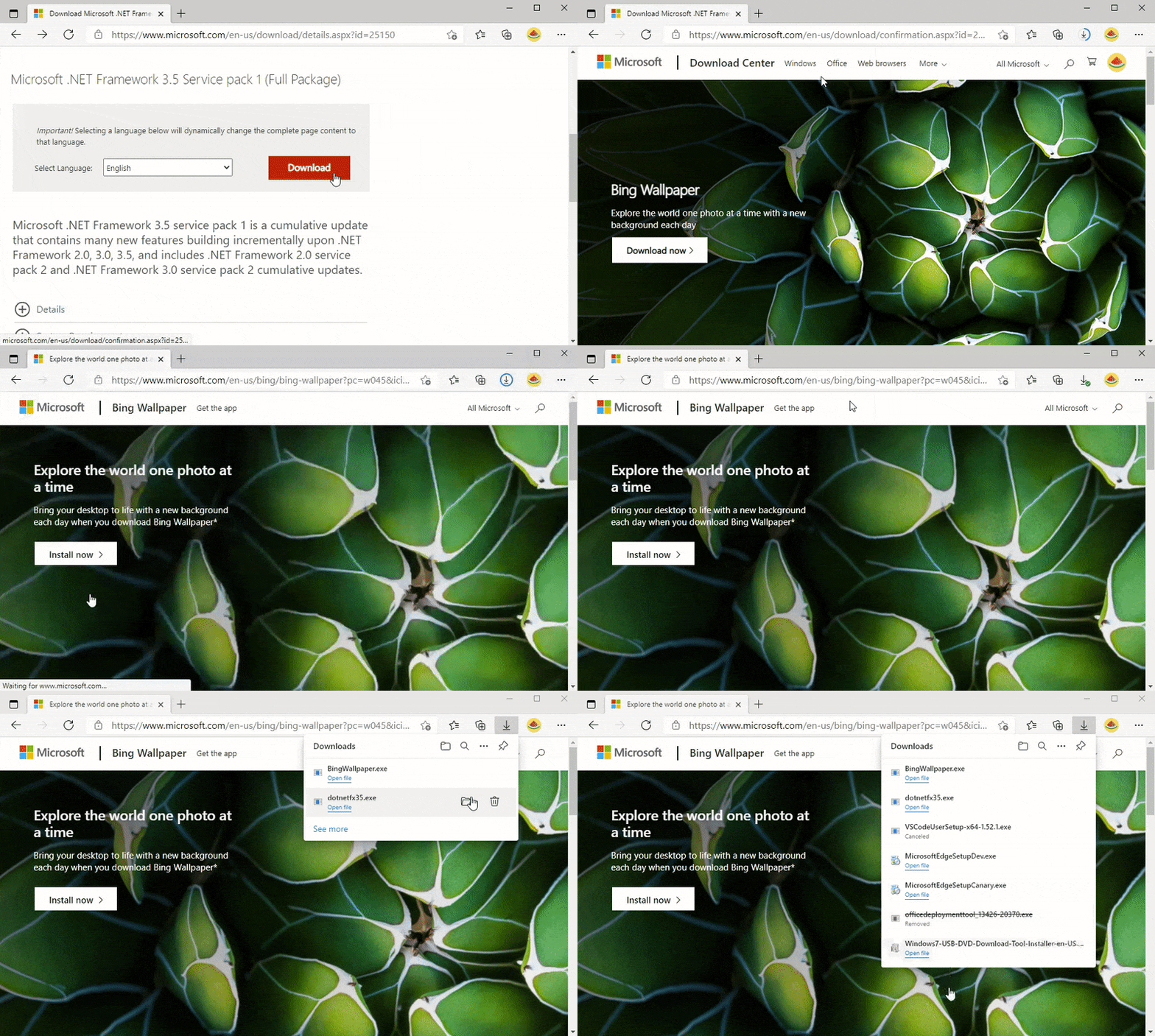
When you start a download, a new menu will now appear in the top-right corner with all your active downloads in one place. This menu is easily dismissible so you can continue browsing uninterrupted. Best of all, you can monitor your overall download progress right from the toolbar thanks to the new progress ring on the downloads button.
Simply click on the downloads button at any time to view all your downloads again. You can hover over or right-click on files in the list to pause, restart, or cancel a download. You can also select See more to view and manage your past downloads as well. And as with the recently updated experiences for favorites, history, and as of today Collections, you can even pin (
The downloads button will remain in the toolbar until all the downloads have finished, at which point the progress ring will change into a green checkmark. Simply open the menu to see your finished downloads and hide the downloads button again.
If you haven’t downloaded a file recently, you can still access the new downloads menu from the Settings and More menu (
For those of you who prefer a more immersive view of your downloads, you can easily get back to the downloads page by selecting Manage downloads in the downloads menu (
We’re so excited to hear what you think of the new downloads experience, which is currently available in the Canary and Dev channels. Please send us your thoughts by submitting feedback in-app and in the comments below.
— William Devereux, Senior Program Manager, Microsoft Edge
- Mark as New
- Bookmark
- Subscribe
- Mute
- Subscribe to RSS Feed
- Permalink
- Report Inappropriate Content
Apr 08 2021 10:57 AM
Thank you for all of your feedback! Starting with today's Canary build (91.0.851.0), we've added a few additional ways to quickly access the full page. Learn more.
- Mark as New
- Bookmark
- Subscribe
- Mute
- Subscribe to RSS Feed
- Permalink
- Report Inappropriate Content
Apr 19 2021 04:04 PM
You say "a common criticism" but ignore the proportion of normal users that never complained about this. There now I have given you some real user feedback that everyone wants because why would anyone want to click a download link and then Save As to get the file save dialog every friggen time?!
- Mark as New
- Bookmark
- Subscribe
- Mute
- Subscribe to RSS Feed
- Permalink
- Report Inappropriate Content
Apr 19 2021 04:18 PM
- Mark as New
- Bookmark
- Subscribe
- Mute
- Subscribe to RSS Feed
- Permalink
- Report Inappropriate Content
Apr 19 2021 04:44 PM
@Wyatt C Jackson I searched many times in both settings and flags and of course online. I couldn't find any way to avoid the delay and click each time I want to download something. Kinda feels like users like me are getting punished for not wanting to dump all our downloads in a downloads folder.
- Mark as New
- Bookmark
- Subscribe
- Mute
- Subscribe to RSS Feed
- Permalink
- Report Inappropriate Content
Apr 20 2021 12:33 AM
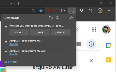
They need to show all 3 options, Open, Save, Save as by default, without hiding any of them. it will save clicks and time. that's the best design. but Edge developers never responded about this suggestion.
- Mark as New
- Bookmark
- Subscribe
- Mute
- Subscribe to RSS Feed
- Permalink
- Report Inappropriate Content
Apr 20 2021 07:29 AM
However as it has been displayed in the screenshot, we don't see notification like it has been checked with SmartScreen filter and is safe.
I am aware when it is malicious and/or there is an issue with the SmartScreen filter you will get notification but it would have been nice to show some icon in download and download manager like it has been checked with SmartScreen filter and it is safe (like when mouse over).
- Mark as New
- Bookmark
- Subscribe
- Mute
- Subscribe to RSS Feed
- Permalink
- Report Inappropriate Content
Apr 20 2021 09:34 AM
@Reza_Ameri wrote:
Thank you for letting us and this is very nice feature.
However as it has been displayed in the screenshot, we don't see notification like it has been checked with SmartScreen filter and is safe.
I am aware when it is malicious and/or there is an issue with the SmartScreen filter you will get notification but it would have been nice to show some icon in download and download manager like it has been checked with SmartScreen filter and it is safe (like when mouse over).
I don't think that's a good idea.
when something is safe then it's safe already and don't need to show extra information. only when the download is problematic and contains malware.
I've seen feedbacks from users complaining about extra information in Edge UI, such as the one recently added to Edge stable in the update page about policies,
or in feedback hub complains about Windows Defender showing notifications when there is no malware found on the system, but just letting user know.
so it's better to keep things simple and only show extra notification, icon etc. whenever is necessary.
antivirus, smart screen etc. should be as transparent as possible and stay away from users' activities unless really necessary.
- Mark as New
- Bookmark
- Subscribe
- Mute
- Subscribe to RSS Feed
- Permalink
- Report Inappropriate Content
Apr 20 2021 09:56 AM
You can always disable this "new download".
I don't like it.
The features are not of my liking.
I still want the bottom bar and nothing you are making is useful for me.
Why are you punishing us? why are we forced to use this new download or go back to Google's Chrome?
Give me a flag to "use the old download bar"
- Mark as New
- Bookmark
- Subscribe
- Mute
- Subscribe to RSS Feed
- Permalink
- Report Inappropriate Content
Apr 20 2021 03:53 PM
@HotCakeX If the download isn't happening immediately when clicking the link, the battle is lost. Clicking Open/Save/SaveAs is inconvenient and annoying. I understand that the Open (i.e. temporary download) is a useful feature but I use it so rarely that it should just become an option that, when disabled, skips the extra button click. Or perhaps a redesign in which the file can get marked as temporary some other way instead of delaying the download and requiring an extra click.
- Mark as New
- Bookmark
- Subscribe
- Mute
- Subscribe to RSS Feed
- Permalink
- Report Inappropriate Content
Apr 21 2021 05:48 PM
@William Devereux Is there a flag to disable this? My laptop is slow and it takes 3 seconds to open the downloads hub. Please add a flag.
- Mark as New
- Bookmark
- Subscribe
- Mute
- Subscribe to RSS Feed
- Permalink
- Report Inappropriate Content
Apr 21 2021 11:13 PM
- Mark as New
- Bookmark
- Subscribe
- Mute
- Subscribe to RSS Feed
- Permalink
- Report Inappropriate Content
Apr 22 2021 05:53 AM
- Mark as New
- Bookmark
- Subscribe
- Mute
- Subscribe to RSS Feed
- Permalink
- Report Inappropriate Content
Apr 22 2021 08:00 AM
We like to force enable this to prevent users from pit-falling into drive-by-downloads.
- Mark as New
- Bookmark
- Subscribe
- Mute
- Subscribe to RSS Feed
- Permalink
- Report Inappropriate Content
Apr 22 2021 09:58 AM
@Reza_Ameri wrote:
Actually this is ne feedback I received where people asking why it is not showing any notification about the scanning and they are worried whether their SmartScreen filter is on or off. It could be like a simple message like it is scanned or show shield icon.
I've received a bunch of feedbacks about the exact opposite behavior.
- Mark as New
- Bookmark
- Subscribe
- Mute
- Subscribe to RSS Feed
- Permalink
- Report Inappropriate Content
Apr 22 2021 11:42 PM
- Mark as New
- Bookmark
- Subscribe
- Mute
- Subscribe to RSS Feed
- Permalink
- Report Inappropriate Content
Apr 22 2021 11:44 PM
- Mark as New
- Bookmark
- Subscribe
- Mute
- Subscribe to RSS Feed
- Permalink
- Report Inappropriate Content
Apr 23 2021 02:30 AM
And excuse me but "and it was difficult to get back to your downloads" so one clic to open explorer and a second to open "downloads" file is difficult ?? When now, you permanently have to clic twice to open this invisible download hub then to open the file ?
Hate this feature
Thanks for the option -disable-features=msDownloadsHub
Litteraly no one ask to develop something like that.
- Mark as New
- Bookmark
- Subscribe
- Mute
- Subscribe to RSS Feed
- Permalink
- Report Inappropriate Content
Apr 23 2021 06:45 AM
- Mark as New
- Bookmark
- Subscribe
- Mute
- Subscribe to RSS Feed
- Permalink
- Report Inappropriate Content
Apr 23 2021 12:02 PM
- Mark as New
- Bookmark
- Subscribe
- Mute
- Subscribe to RSS Feed
- Permalink
- Report Inappropriate Content
Apr 23 2021 12:05 PM


