Turn on suggestions
Auto-suggest helps you quickly narrow down your search results by suggesting possible matches as you type.
- Home
- Microsoft Teams
- Microsoft Teams
- Reporting Accessibility/Readability Flaw: Contrasts of Code in the Dark Theme (Web)
Reporting Accessibility/Readability Flaw: Contrasts of Code in the Dark Theme (Web)
Discussion Options
- Subscribe to RSS Feed
- Mark Discussion as New
- Mark Discussion as Read
- Pin this Discussion for Current User
- Bookmark
- Subscribe
- Printer Friendly Page
- Mark as New
- Bookmark
- Subscribe
- Mute
- Subscribe to RSS Feed
- Permalink
- Report Inappropriate Content
Oct 15 2019 11:56 PM
Because I couldn't send or put screenshots in the Feedback text box inside the Teams client, I'm reporting the "bug" here. It's not really a feature either (more like a necessity), so I didn't file this as a feature request.
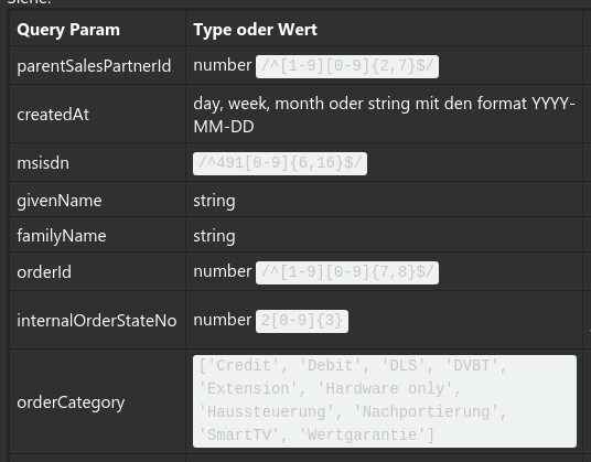
I'm using the Dark Theme in my Teams Client. This morning I looked at a table one of my colleagues posted in a channel in one of our teams and I couldn't really read the text that was marked as code. The contrasts here aren't that great ...
Example:
Could this be improved in a future release? Please change the background or text color for a better readability of text that is marked as code.
Labels:
- Labels:
-
Microsoft Teams
-
User Interface
0 Replies
