- Home
- Microsoft Intune and Configuration Manager
- Intune Customer Success
- Support Tip: Using PowerBI to build custom reports with Intune data
- Subscribe to RSS Feed
- Mark as New
- Mark as Read
- Bookmark
- Subscribe
- Printer Friendly Page
- Report Inappropriate Content
By Aaron Hamilton | Principal Program Manager on the Enterprise Mobility and Customer Experience Engineering Team
Mobile Device administrators frequently find themselves asked by other departments for complex reports or dashboards to help other stakeholders get answers to critical questions. The administrators can use the console and Graph API to get reports, but if the report is needed on an ongoing basis, they might have to frequently refresh or rebuild the report. This is where the Intune Data Warehouse (IDW) coupled with PowerBI can be extremely powerful.
In this example, let’s say that the security team wants to understand the lay of the land for the company’s Android footprint across all their users. The security team has asked the mobile device team to help them understand a few key data points and wants to be able to slice the data based on the following types of questions:
- How many Android devices are in our environment??
- What is the breakdown by OS version?
- What is the breakdown by Manufacturer?
- What is the breakdown by Security Patch Level?
- How do we get associated users or devices (as a best practice, follow RBAC permissions) for a given OS, Version, Manufacturer, Patch Level?
Using the IDW and Power BI the MDM team can provide a simple to use report that answers all these questions and makes it easy to read the data and understand what the environment looks like.
In this post, we’re going to build this sample report, show you some basics on how to use the report, and then how to publish it so others within your organization with the appropriate permissions can access it directly through the Power BI portal. Doing all this will provide a few extra capabilities:
- Online and delegated report access
- Automatic data refresh
- Ability to customize the report/view
- Use of natural language queries
Steps to build your report
- Install Power BI Desktop. You can either download it from PowerBi.com or on Windows 10 install it from the Windows Store. I recommend installing it from the store because the store will automatically update the Power BI desktop install as new versions are released; the direct download will not automatically update.
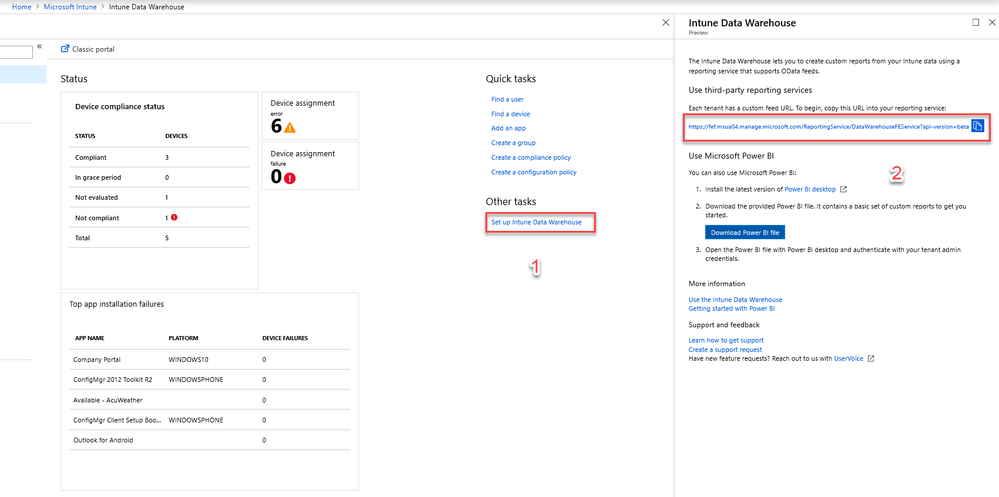
- Browse to the Intune Portal and copy your IDW URL as shown below:
- Open Power BI desktop, login, and then click on the “Get Data”:
- Select “OData feed” from the drop down:
- Paste your Data Warehouse URL into the OData Feed URL field and click on “OK”:
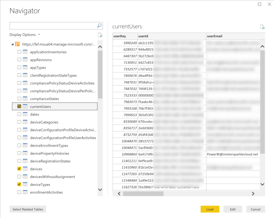
- Next Power BI will show you all the available data in the IDW. For this report, we’re going to select the following entities:
- currentUsers
- devices
- deviceTypes
- mdmStatuses
Your screen will look something like this:
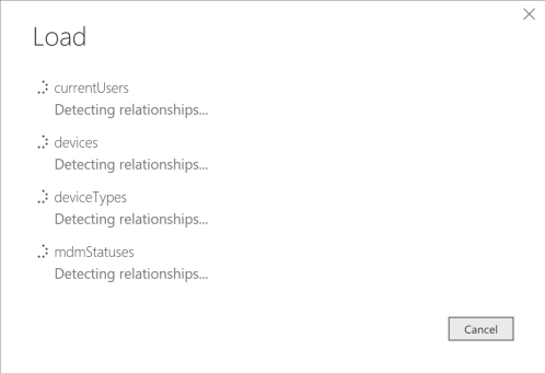
- Click on the “Load” button and wait for Power BI to finish loading your data:
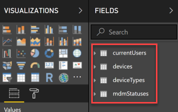
- After Power BI has loaded your data you will see the entities loaded under “fields”:
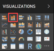
- We’re going to start with building charts to display our Android device data. Click on the stacked vertical bar chart to add the bar chart to your page:
- Your page will now have a stacked bar chart on it. Drag it to resize and fill roughly 2/3 of the page:
- Now click on the bar chart, expand the devices field, and drag the deviceID field to the “value” field under for the chart visualization. You should immediately see a bar representing the total device count for all of your enrolled devices:
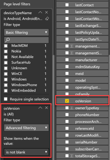
- Next, because we’re only interested in active Android devices, we’re going to apply a page filter to exclude everything but Android devices currently enrolled. Expand the deviceTypes field and select deviceTypeName and drag it to page level filters, then check the boxes for Android, AndroidEnterprise,AndroidForWork. Repeat this for devices.osVersion, select advanced filtering, and then “not blank”. Repeat again for devices.isDeleted and select per below:
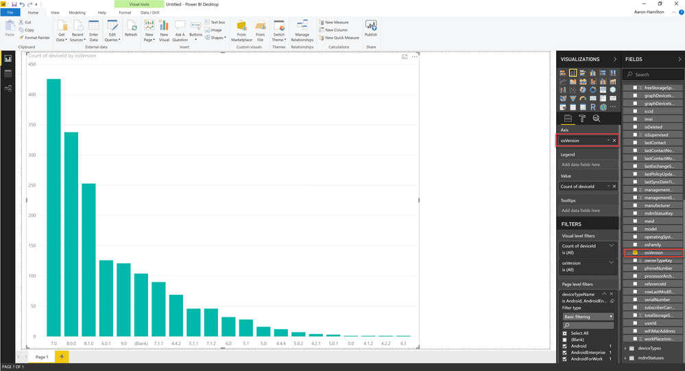
- Now we’d like to be able to break out our Android devices by OS version. Select your chart, expand the devices field, click on OSversion and drag it to axis under visualizations. You’ll see your chart then update and the device counts are now broken out by OS version:
- Next, we’re going to re-sort the chart based on the OS version itself. Click on the ellipses in the upper right-hand corner of your chart, select Sort by, and then osVersion:
- Then return to the same options and sort them in ascending order:
- Your chart should now have all the Android devices broken out by OS version and sorted in ascending order:
- If we want to exclude the “blank” values (failed enrollments or other issues), we can then add a page filter again based on OS version. Under devices, drag osVersion to page filters, change the filter type to Advanced filtering, and then select “is not blank”:
- Next, we’re going to add the ability to see for each OS version the various patch levels. Click on your chart, expand devices, and then select androidSecurityPatchLevel and drag it to Legend on the Visualizations blade:
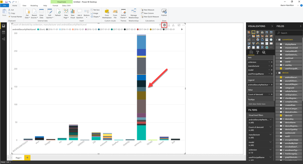
- Now to enable drill down, we’re going to add one or more fields to the Axis field. For this example, we’re going to add the ability to drill down by manufacturer, then model. If you want additional fields (like user, etc.) you would just add more fields. As you drag the field you should see a yellow line below the existing fields, osVersion in this example:
- Repeat this process for fields you’d like to drill down on and it should look something like this when completed:
- Now you can click on the downward arrow on your chart to enable drill down and then click on a data point to drill down into the chart. In this example, I have drilled down into OS version 7 and I can see the manufacturers. Click again would show me the models for each. I click on the upward arrow to go back up a level:
- Next, we’re going to add some slicers to help quickly narrow the focus on a report. This will allow someone using the report to select a few key data items and change the graph. Click on blank portion of the page and then select slicer from the visualizations. Note: If your chart suddenly changes, just hit ctrl-z and make sure you don’t have your chart selected before you click on the slicer, or it will change your existing chart to a slicer:
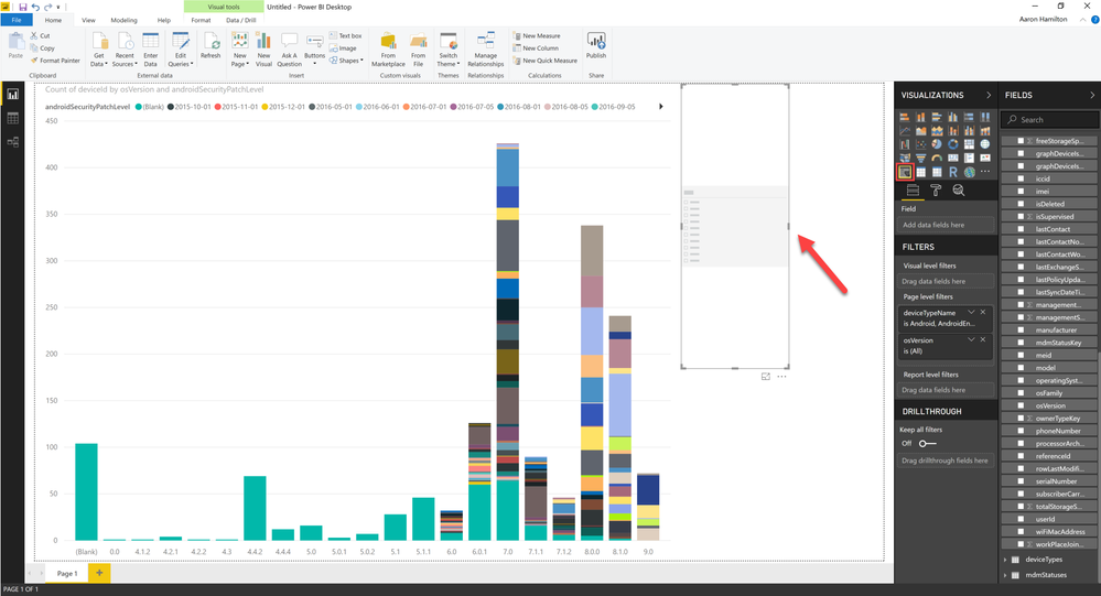
- Now with your slicer selected we’re going to select osVersion. You’ll then see a slicer available OS version and be able to select one or more versions:
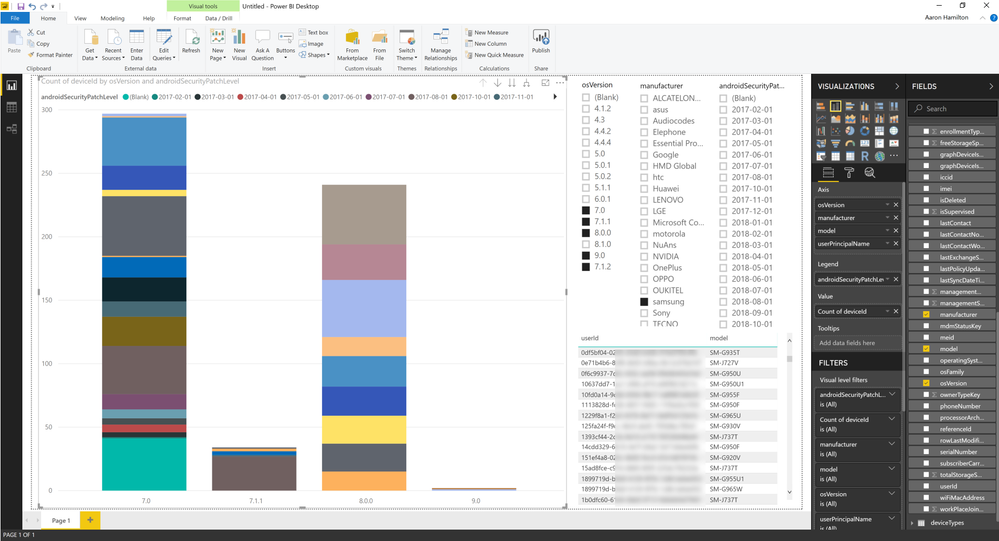
- Add additional sliders for manufacturer and androidSecurityPatchLevel and resize to fit appropriately:
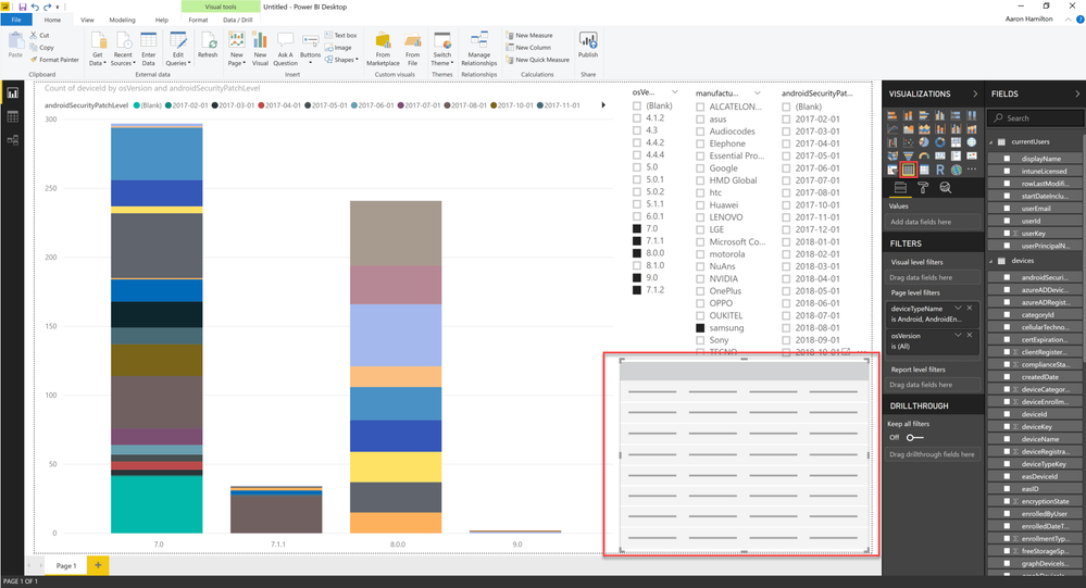
- To add the ability to easily view the associated users and devices, we’re going to also add a grid control and display fields. Click on the grid control in visualization to add it to the chart.
- Select the grid and then add any display fields you’d like to display from the column data. In this example, I’ve added userID and model from devices. Note if you attempt to add fields that do not have relationships then an error will be thrown. To correct this error, you will either need to use different fields or manually build relationships:
- Now to make this report available, we’ll click on publish in the ribbon and publish it directly into the Power BI portal:
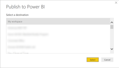
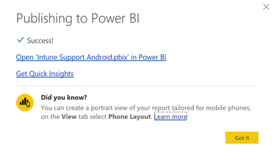
- Select a workspace to publish the report to and click on “Select” and it should publish successfully to the Power BI portal. Note you will be prompted to save your file. Make sure you name it something meaningful as this will be the name it shows up within the portal:
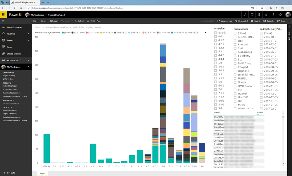
- Published report will show under Reports in the Power BI Portal:
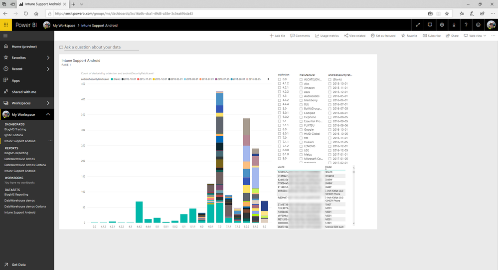
- Now to build a dashboard click on the “Pin Live Page” button on the center of the page, then select “New dashboard” and then name your new dashboard:

- You will now see your report as a dashboard:
- You can now also use the Q&A “Ask a question about your data” for natural language queries:
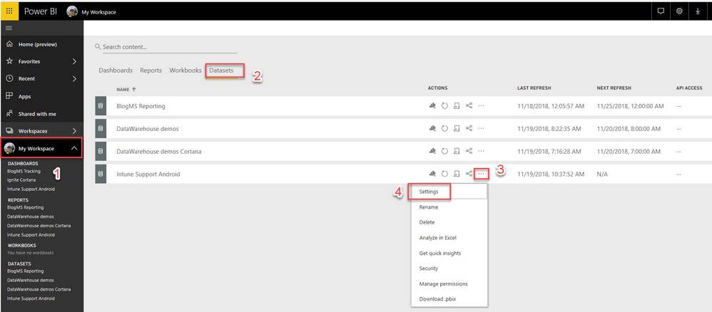
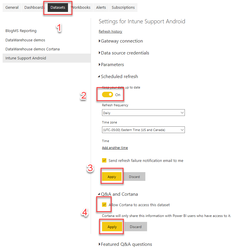
- To setup automatic refresh of the data and Cortana access click on My Workspace, then datasets, select the Android report, click on the ellipses, and then settings. On the settings screen click on datasets, expand scheduled refresh and enable, then expand Q&A and Cortana and check the box to allow Cortana to access the data. Click apply on both options:
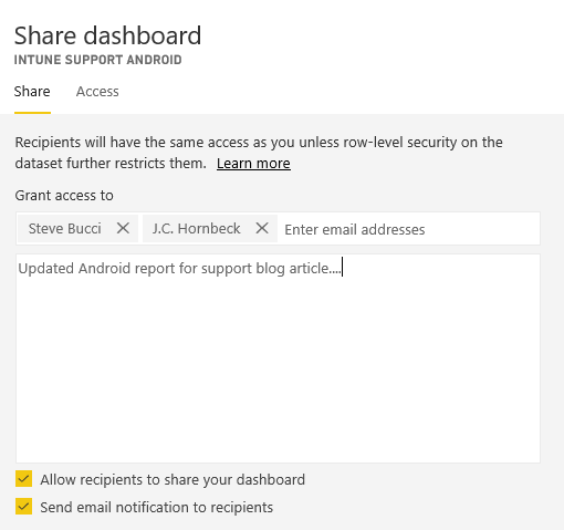
- Finally let’s share the work with the requestors. Go back to the dashboard and click on “Share” and then enter the email addresses of the requestors on the sharing screen:
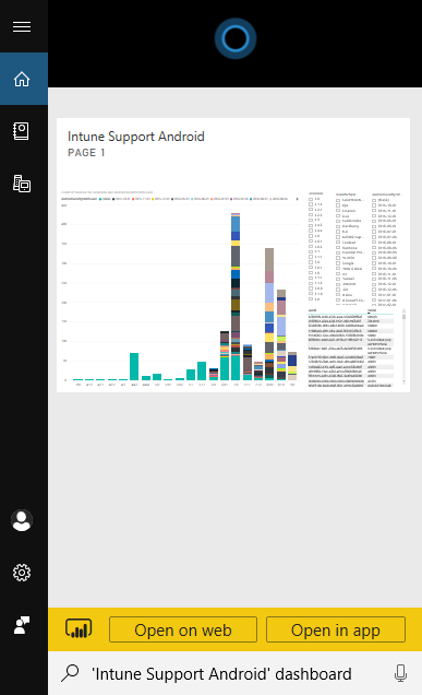
- Also check out the Cortana integration from the desktop. Note that this is rendering in the full-size page we created. If you wanted the format to be appropriately sized, you could create Cortana-friendly reports by editing the page size in Power BI and then publish these as Cortana pages. This approach would be great for basic metric reports like total enrolled devices, compliance across all platforms, and reporting other KPI’s.
Let us know if you have any questions on this post and creating PowerBI dashboards and reports for your teams, and how these steps work for you when using the Intune data warehouse and PowerBI.
You must be a registered user to add a comment. If you've already registered, sign in. Otherwise, register and sign in.
