Turn on suggestions
Auto-suggest helps you quickly narrow down your search results by suggesting possible matches as you type.
Discussion Options
- Subscribe to RSS Feed
- Mark Discussion as New
- Mark Discussion as Read
- Pin this Discussion for Current User
- Bookmark
- Subscribe
- Printer Friendly Page
- Mark as New
- Bookmark
- Subscribe
- Mute
- Subscribe to RSS Feed
- Permalink
- Report Inappropriate Content
Jul 12 2019 10:56 AM
I am doing an XY scatter graph that shows data for a span of 20 years. However, when the graph is made, the x-axis timeline goes all the way back to 1900. How do you adjust the timeline to only focus on my selected time frame?
Labels:
- Labels:
-
Excel
1 Reply
- Mark as New
- Bookmark
- Subscribe
- Mute
- Subscribe to RSS Feed
- Permalink
- Report Inappropriate Content
Jul 12 2019 01:46 PM
The easiest fix might be to try a line chart rather than a scatter chart. Line charts understand dates and times.
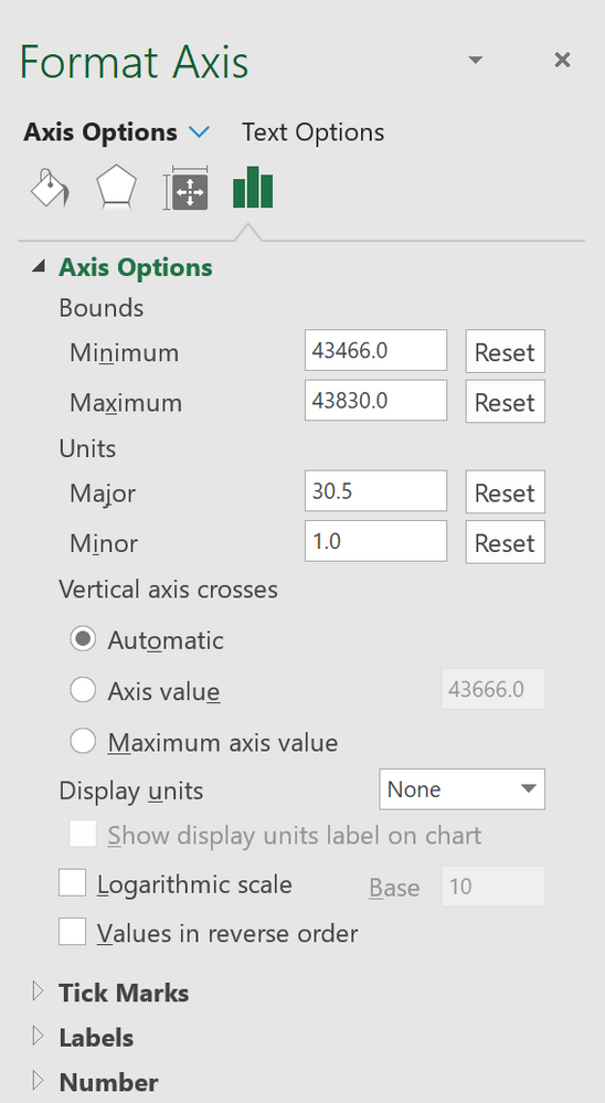
If you still want to use a scatter chart, then you need to change the X-axis minimum scale to a reasonable value.
- Enter the desired minimum and maximum dates in two blank cells
- Format those cells with Number format and no decimal places
- Rightclick the X-axis on your chart, then choose Format axis from the resulting popup
- Go to the Text tab in the resulting task pane by clicking the green column chart icon
- You will be entering the numbers from step 2 in the Minimum and Maximum scale fields. These appear to have been renamed Minimum and Maximum Bounds in my Office Insider copy of Excel 2016/Office 365.
- You may also want to change the Major Units to 30.5 to display your dates along the axis in roughly one month increments.
