- Subscribe to RSS Feed
- Mark Discussion as New
- Mark Discussion as Read
- Pin this Discussion for Current User
- Bookmark
- Subscribe
- Printer Friendly Page
- Mark as New
- Bookmark
- Subscribe
- Mute
- Subscribe to RSS Feed
- Permalink
- Report Inappropriate Content
Feb 06 2019 02:13 PM
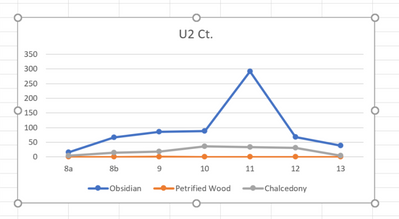
Hey Everyone! I've been working on this problem for a few days now and I can't get it going. I need to create a vertical line chart. It's easier to show in photos. I have this....
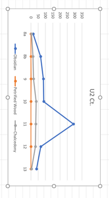
I want it to be rendered like this (created by rotating previous photo).....
What would become the Y-axis (the categories) are text. I've tried just flipping the axes in the "Select Data" dialog box, but I think the problem is that Excel keeps wanting anything on the Y-axis to be numerical rather than textual; it then messes up the values of my data across the X-axis when I try just flipping the two.
Anyone have any ideas? I am not a coder; I can't write VBA. I'd be willing to learn, but I'm in the middle of thesis writing so that would be difficult to add at the moment.
Thanks in advance!
-Mike
- Labels:
-
Charting
-
Excel
-
line
-
line charts
- Mark as New
- Bookmark
- Subscribe
- Mute
- Subscribe to RSS Feed
- Permalink
- Report Inappropriate Content
Feb 06 2019 03:01 PM
A quick Google for 'excel vertical line chart' and I found this which might work - https://www.goodly.co.in/vertical-line-chart-in-excel/
- Mark as New
- Bookmark
- Subscribe
- Mute
- Subscribe to RSS Feed
- Permalink
- Report Inappropriate Content
Feb 07 2019 07:32 AM
- Mark as New
- Bookmark
- Subscribe
- Mute
- Subscribe to RSS Feed
- Permalink
- Report Inappropriate Content
Feb 07 2019 07:58 AM
I've tried that approach. Unfortunately it doesn't work for me since my Y-axis is categorical, not numeric. That's a workaround that only functions in the example because of the numerical nature of the categories.
- Mark as New
- Bookmark
- Subscribe
- Mute
- Subscribe to RSS Feed
- Permalink
- Report Inappropriate Content
Feb 07 2019 08:16 AM
I have looked at that, and I can make it work need be. I am aware that this is an unusual presentation. I am an archaeologist, and this is showing counts per excavation level; the presentation makes sense because I can show data points as each level gets deeper. The lines are easier to see than the bars, mainly because I have several different material types which are quantified and presented simultaneously. I would love the horizontal bar charts if I could add a line from data point to data point (rather than a a trend line). However, I cannot find a way to add that either.
I realized I can create a workaround this morning where I reorient the text for my desired outcome, convert the chart to a graphic, then rotate the graphic itself and add an external title. I'd prefer to have a way for Excel to create the chart I need.
- Mark as New
- Bookmark
- Subscribe
- Mute
- Subscribe to RSS Feed
- Permalink
- Report Inappropriate Content
Feb 07 2019 09:14 AM
You could try:
- Create the chart as Excel defaults to
- Select the cells behind the chart and choose (using the drop-down arrow next to the copy button on the home tab): Copy Picture
- Choose the option you want
- Click where you want the transposed pifture to be and click Paste
- Click in the formula bar, type the equal sign and -again- select the cells underneath the original chart and press enter
- Now rotate the picture (not the chart)
- Try changing anyhting in the chart or its data and see the picture update itself.
See attached example
- Mark as New
- Bookmark
- Subscribe
- Mute
- Subscribe to RSS Feed
- Permalink
- Report Inappropriate Content
Feb 08 2019 09:14 AM
That does seem to work. So far it's created issues just with trying to get the legend to format. I'll keep it in mind. Still wish Excel could just present the chart the way I'd like.
Thanks for the help!
- Mark as New
- Bookmark
- Subscribe
- Mute
- Subscribe to RSS Feed
- Permalink
- Report Inappropriate Content

