- Home
- Microsoft 365
- Excel
- Re: Pie Chart - legend missing one category
Pie Chart - legend missing one category (edited to include spreadsheet)
- Subscribe to RSS Feed
- Mark Discussion as New
- Mark Discussion as Read
- Pin this Discussion for Current User
- Bookmark
- Subscribe
- Printer Friendly Page
- Mark as New
- Bookmark
- Subscribe
- Mute
- Subscribe to RSS Feed
- Permalink
- Report Inappropriate Content
Oct 21 2019 10:14 AM - edited Oct 21 2019 11:58 AM
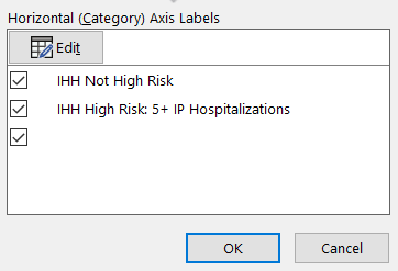
I have set of pie charts and when I add data to some of them, there is one category name that is missing in the legend (it is also missing in the "Horizontal (category) Axis Labels," see below) even though I have selected it a million times!
The data for this category does show up in the pie chart and the color for the category also shows up in the legend (see below). I tried putting the category name on the data label to see if it would show up, and it did not show up there either. I've also tried making the category name short, removing the legend & adding it back, and making the legend larger. None of these fixed it. I also deleted all the category labels, selected all new ones, and all 3 did show up. When I selected the real ones again, that one does not show up.
This is driving me crazy.
Please help.
thanks!
- Labels:
-
Category
-
Excel
-
Office 365
-
pie chart
- Mark as New
- Bookmark
- Subscribe
- Mute
- Subscribe to RSS Feed
- Permalink
- Report Inappropriate Content
Oct 21 2019 11:08 AM
Managed to recreate your issue and suspect that you only copied the data into the graph but not the label. Please have a look at the attached screenshot. In the first graph I only added the yellow cell and created the issue that you describe. In the second graph I added the yellow cells and all looks how you want it to be.
Right click in the chart and press "Select data source". Make sure that the range for "Horizontal (category) axis labels" includes all the labels you want to be included.
PS: I'm working on a Mac, so your screens may look a bit different. But you should be able to find the horizontal axis settings as describe above.
- Mark as New
- Bookmark
- Subscribe
- Mute
- Subscribe to RSS Feed
- Permalink
- Report Inappropriate Content
Oct 21 2019 11:12 AM
Thank you. I am selecting the cell. My data and their related categories are all over the worksheet, so I used CTRL and pick each one separately. My other pie charts are working fine, as far as this issue goes, other than one that has the same issue. I will probably just need to delete those two and start over. I had started from one chart initially, got it the size I wanted, etc., and then copied it a bunch of times.
- Mark as New
- Bookmark
- Subscribe
- Mute
- Subscribe to RSS Feed
- Permalink
- Report Inappropriate Content
Oct 21 2019 11:26 AM
Okay. Upload your chart if you can't get it to work. Than I (or someone else) can hav a look at it.
- Mark as New
- Bookmark
- Subscribe
- Mute
- Subscribe to RSS Feed
- Permalink
- Report Inappropriate Content
Oct 21 2019 11:34 AM
Unfortnately my workbook has all sorts of patient data in it so I can't upload it. I'll see if I have time to make a copy of just the data, without the related formulas, to upload.
- Mark as New
- Bookmark
- Subscribe
- Mute
- Subscribe to RSS Feed
- Permalink
- Report Inappropriate Content
Oct 21 2019 12:52 PM
SolutionIf you don't want to unmerge, then change the label refs in the series formula for the chart.
Click on the pie chart, and in the formula bar, change the merged cell refs to a single cell ref:
-- instead of: $O$21:$S$21 put $O$21
-- instead of: $O$20:$S$20 put $O$20
- Mark as New
- Bookmark
- Subscribe
- Mute
- Subscribe to RSS Feed
- Permalink
- Report Inappropriate Content
Oct 21 2019 01:19 PM
Thank you. I did try un-merging them to see if that was the problem and it did not fix the issue, but I see now that the ones I un-merged were not the ones having the issue. Your suggestion has fixed the problem. I can't thank you enough!
- Mark as New
- Bookmark
- Subscribe
- Mute
- Subscribe to RSS Feed
- Permalink
- Report Inappropriate Content
Oct 22 2019 07:02 AM
Accepted Solutions
- Mark as New
- Bookmark
- Subscribe
- Mute
- Subscribe to RSS Feed
- Permalink
- Report Inappropriate Content
Oct 21 2019 12:52 PM
SolutionIf you don't want to unmerge, then change the label refs in the series formula for the chart.
Click on the pie chart, and in the formula bar, change the merged cell refs to a single cell ref:
-- instead of: $O$21:$S$21 put $O$21
-- instead of: $O$20:$S$20 put $O$20

