- Subscribe to RSS Feed
- Mark Discussion as New
- Mark Discussion as Read
- Pin this Discussion for Current User
- Bookmark
- Subscribe
- Printer Friendly Page
- Mark as New
- Bookmark
- Subscribe
- Mute
- Subscribe to RSS Feed
- Permalink
- Report Inappropriate Content
Jun 06 2019 01:56 PM
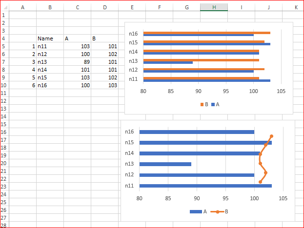
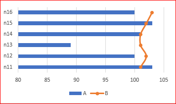
I'm trying to create a combo graph with a bar graph for one series and a line graph for another stacked on top. I want the first series (blue) to be horizontally graphed like so:
but I want the second series (orange) to be a vertical line or even scattered points. Every time I try to convert one series to a line graph, the axis switches:
And when I try to switch it back I get something like this:
- Mark as New
- Bookmark
- Subscribe
- Mute
- Subscribe to RSS Feed
- Permalink
- Report Inappropriate Content
Jun 06 2019 02:39 PM
@Torifox43 , if you mean something like this
1) Change orange series to Scatter type
2) Add helper column to your data (before names here)
3) Right click on chart, Select Data, Edit series B (scatter), select B column as X and helper column as Y
4) disable secondary vertical axis
- Mark as New
- Bookmark
- Subscribe
- Mute
- Subscribe to RSS Feed
- Permalink
- Report Inappropriate Content
Jun 06 2019 03:12 PM
@Sergei Baklan Yes, that's exactly what I want, but I'm having trouble following. I added the helper column, but am I supposed to include it when inserting the graph?
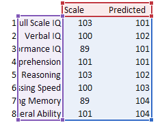
Either way, if I include it or don't, I'm not getting an option to select any x or y values, it just shows me this:
- Mark as New
- Bookmark
- Subscribe
- Mute
- Subscribe to RSS Feed
- Permalink
- Report Inappropriate Content
Jun 06 2019 04:04 PM
Solution
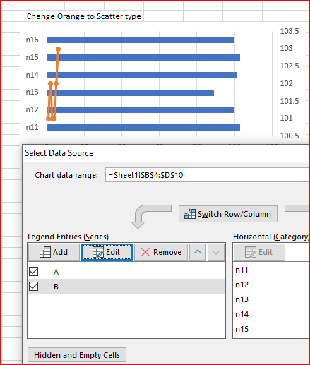
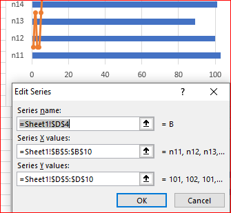
After you convert orange bar to scatter and Select Data for the resulting chart it looks like
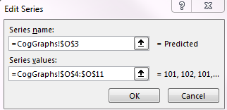
Here click on Edit Scatter series (B), you'll see something like
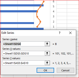
Here change X and Y values:
All these steps are in the file I attached to previous post.
- Mark as New
- Bookmark
- Subscribe
- Mute
- Subscribe to RSS Feed
- Permalink
- Report Inappropriate Content
Jun 07 2019 09:44 AM
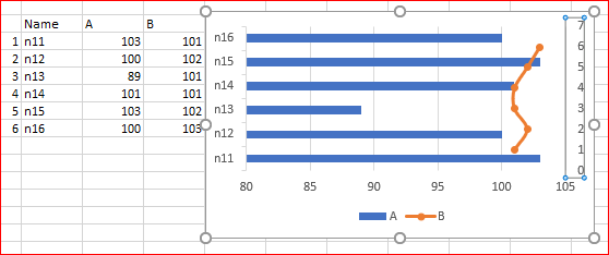
@Sergei Baklan Thank you so much! The only problem I'm having now is that the scatterplot isn't matching up perfectly with the bar graph. Is there a way to correct this? I tried doing it with the bounds- but this is as close as I could get it
- Mark as New
- Bookmark
- Subscribe
- Mute
- Subscribe to RSS Feed
- Permalink
- Report Inappropriate Content
Jun 07 2019 10:38 AM
Please try as following - enable secondary vertical axis
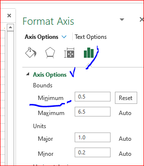
click on it to format and here change default minimum value on 0.5 (instead of zero). Major unit shall be 1 by default (otherwise change on 1), maximum will go on 6.5 in my case
Now disable secondary vertical axis, finally it'll be like
Accepted Solutions
- Mark as New
- Bookmark
- Subscribe
- Mute
- Subscribe to RSS Feed
- Permalink
- Report Inappropriate Content
Jun 06 2019 04:04 PM
Solution
After you convert orange bar to scatter and Select Data for the resulting chart it looks like
Here click on Edit Scatter series (B), you'll see something like
Here change X and Y values:
All these steps are in the file I attached to previous post.


