- Home
- Microsoft 365
- Excel
- Donut/Doughnut Chart - Multiple Series
Donut/Doughnut Chart - Multiple Series
- Subscribe to RSS Feed
- Mark Discussion as New
- Mark Discussion as Read
- Pin this Discussion for Current User
- Bookmark
- Subscribe
- Printer Friendly Page
- Mark as New
- Bookmark
- Subscribe
- Mute
- Subscribe to RSS Feed
- Permalink
- Report Inappropriate Content
Jan 08 2019 04:27 AM
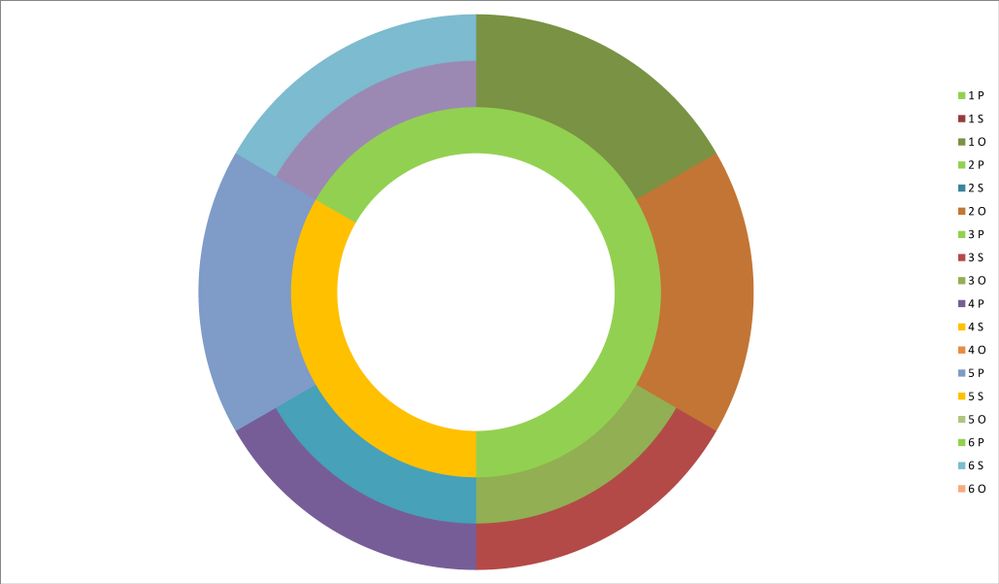
I have created a doughnut chart with multiple series (represented by multiple rings - see charts below). Each ring is divided into 6, the colour of which corresponds to one of three options (yes, maybe and no). I therefore want the colour of the chart to represent this clearly (green, yellow and red), making each ring comparable - i.e. so that the entire chart is made up of only three colours.
When I format the legend entry to edit the colours, it only applies the changes to the inner ring/the first series. I am able to manually edit the colour of every other ring segment, however with a lot more data to add this will take a very long time and mean that I am no able to easily edit it should I wish to change the colour again. I imagine there is a way to do this in one simple step, however am unable to find it.
Does this make sense? Any help would be greatly appreciated. Please let me know if I need to make this clearer/explin further. Thanks!
Chart 1 - the automatically generated chart where only the colours of the inner ring have changed as I have edited them.
Chart 2 - I have manually edited this chart to show how I want the chart to look - i.e. I want any colours that I change to apply to all series
- Labels:
-
Charting
-
Charts
-
donut
-
doughnut chart
-
Excel
-
Formatting

