- Home
- Microsoft 365
- Excel
- Re: Creating Chart from multiple Pivot tables
Creating Chart from multiple Pivot tables
- Subscribe to RSS Feed
- Mark Discussion as New
- Mark Discussion as Read
- Pin this Discussion for Current User
- Bookmark
- Subscribe
- Printer Friendly Page
- Mark as New
- Bookmark
- Subscribe
- Mute
- Subscribe to RSS Feed
- Permalink
- Report Inappropriate Content
Sep 19 2019 01:38 AM
I have a set of data as uploaded.
I need to have distinct count from suppliers within a specific period.
The details are mentioned in the excel data itself. Can someone please help me?
Thanks in advance.
- Mark as New
- Bookmark
- Subscribe
- Mute
- Subscribe to RSS Feed
- Permalink
- Report Inappropriate Content
Sep 19 2019 09:04 AM
That's better to do with DAX. First, create Date table in your model (to simplify could be done within Power Pivot clicking on New Date table) and link it one-to-many with your Range table.
Next add two measures
Vendor Distinct Count :=
DISTINCTCOUNT ( Range[Vendor] )
and
Running Year Distinct Count:=CALCULATE (
    [Vendor Distinct Count],
    DATESINPERIOD ( 'Calendar'[Date], MAX ( 'Calendar'[Date] ), -1, YEAR )
)
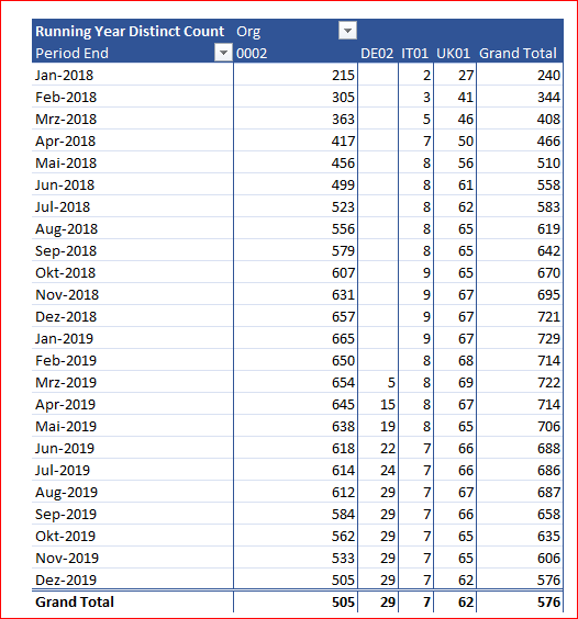
and build Pivot Table from data model using measures, connect existing slicers to that Pivot Table.
Result is as
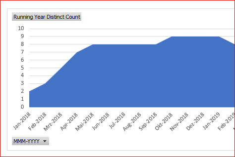
It like this
but very depends on which kind of chart you'd like to have.
- Mark as New
- Bookmark
- Subscribe
- Mute
- Subscribe to RSS Feed
- Permalink
- Report Inappropriate Content
Sep 19 2019 10:51 PM
@Sergei Baklan Dear Sergei,
Thank you very much for your answer.
Actually I need to compare yearly increase or decrease of our suppliers in database. Like for month Dec 18 I will take the values of Jan 2018-Dec 2018. (sorry by mistake I mentioned wrong date).
Is it possible to make such buckets of the following...
| Dec 19 | Jan 18 - Dec 19 |
| Jan 19 | Feb 18 - Jan 19 |
| Feb 19 | Mrz 18 - Feb 19 |
| Mrz 19 | April 18 - Mrz 19 |
| Apr 19 | May 18 - April 19 |
| Mai 19 | June 18 - May 19 |
| Jun 19 | July 18 - June 19 |
| Jul 19 | Aug 18 - July 19 |
| Aug 19 | Sep 18 - Aug 19 |
then I want to simply show in bar chart where we can easily see the number decreased or increased.
It would be great if I can do the same on quarterly basis.
Thank you
- Mark as New
- Bookmark
- Subscribe
- Mute
- Subscribe to RSS Feed
- Permalink
- Report Inappropriate Content
Sep 20 2019 02:04 AM
@Sergei Baklan Hi,
I think I got it. I just selected the months I wanted and it gives me th result.
Now how can i do this for quarterly basis?
Secondly, is there any way to show the Grand total in Bar chart? i am not able to do it.
See the file.
Thank you
- Mark as New
- Bookmark
- Subscribe
- Mute
- Subscribe to RSS Feed
- Permalink
- Report Inappropriate Content
Sep 20 2019 01:35 PM
Hi,
You may add more calculated columns to Dates table in data model.
For Periods
=FORMAT(DATEADD('Calendar'[Date],-1,YEAR),"MMM YY") &
  " - " & FORMAT([Date],"MMM YY")
For Quarters
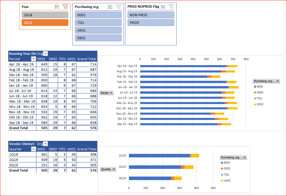
=ROUNDUP(MONTH('Calendar'[Date])/3,0) & "Q" & FORMAT('Calendar'[Date],"YY")Add Pivot Table and Pivot Chart using quarters and aggregating Vendor Distinct Count measure.
All together is as
Please check in attached
- Mark as New
- Bookmark
- Subscribe
- Mute
- Subscribe to RSS Feed
- Permalink
- Report Inappropriate Content
Sep 20 2019 01:41 PM
SolutionI didn't sort months/periods in previous variant, corrected in attached.
Accepted Solutions
- Mark as New
- Bookmark
- Subscribe
- Mute
- Subscribe to RSS Feed
- Permalink
- Report Inappropriate Content
Sep 20 2019 01:41 PM
SolutionI didn't sort months/periods in previous variant, corrected in attached.


