- Home
- Microsoft Edge Insider
- Discussions
- Visual design improvements in Edge Browser
Visual design improvements in Edge Browser
- Subscribe to RSS Feed
- Mark Discussion as New
- Mark Discussion as Read
- Pin this Discussion for Current User
- Bookmark
- Subscribe
- Printer Friendly Page
- Mark as New
- Bookmark
- Subscribe
- Mute
- Subscribe to RSS Feed
- Permalink
- Report Inappropriate Content
Nov 13 2019 07:32 PM - edited Nov 13 2019 07:35 PM
Just tried out the new Edge in beta. While I understand there are still many things in flux, I noticed some things and would like to add some thoughts-
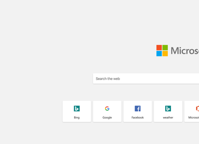
For the longest time, the Bing logo rendered fuzzy on my Mac - it still does when you look at Bing Maps and on the list of favorite websites on the home page. Other places where icons are fuzzy are under the Office hyperlink on the home page.
There's also slight differences when you move between tabs in settings (the title position moves).
The Tabs shouldn't be all caps, it makes it difficult to read.
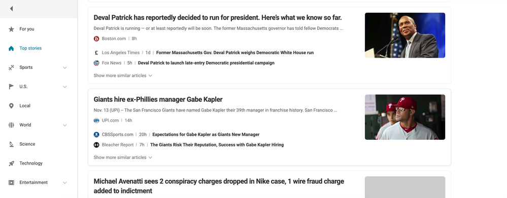
The article length under Bing News should be 8-11 words max. I have a larger screen but this is a general reading principle. I also suggest that the names of the other articles comes before their source (secondary information), as I care more about reading the subject of the article first. It also aligns the article titles.
I have no way to get to My Saves from the Bing Home page and I'd like to - I think of My Saves almost like a collection of favorites on Pinterest (whether for interests or research) and wish they were more interactive and draggable like cards.
The use of icons is inconsistent - from a thin line style to a full solid style. Also the use of greys and corners of cards.
Sometimes the use of an icon is unnecessary - like on the New Tab.
- Labels:
-
Design
-
Edge
-
visual design
- Mark as New
- Bookmark
- Subscribe
- Mute
- Subscribe to RSS Feed
- Permalink
- Report Inappropriate Content
Nov 13 2019 11:18 PM
I think the Bing team, people in charge of the Bing engine, need to get this feedback too.
because half of it is related to them


