- Home
- Microsoft Edge Insider
- Discussions
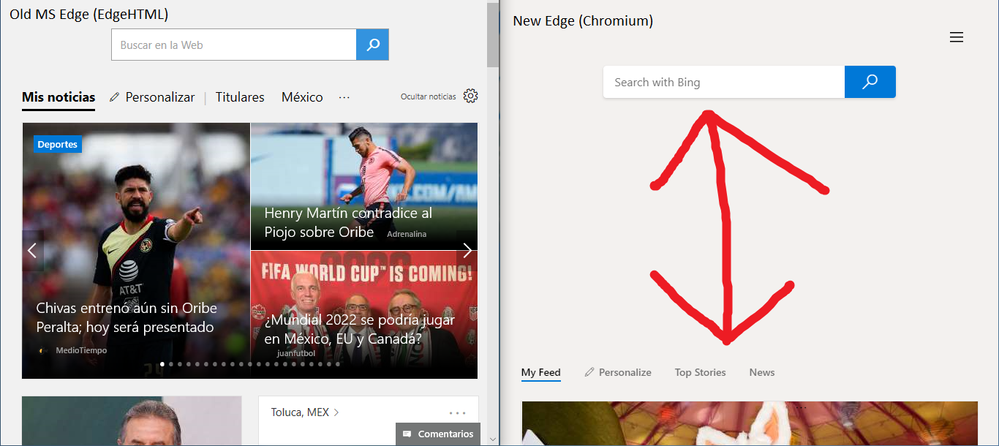
- Big space between search box and feed. [Sugestion]
Big space between search box and feed. [Sugestion]
- Subscribe to RSS Feed
- Mark Discussion as New
- Mark Discussion as Read
- Pin this Discussion for Current User
- Bookmark
- Subscribe
- Printer Friendly Page
- Mark as New
- Bookmark
- Subscribe
- Mute
- Subscribe to RSS Feed
- Permalink
- Report Inappropriate Content
Jun 19 2019 10:37 AM - edited Mar 10 2021 06:23 AM
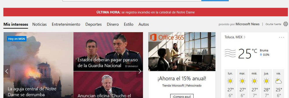
Without the most visited sites, there is a great blank space between the search box and the news feed. It would look better without this space like the old Edge.
- Mark as New
- Bookmark
- Subscribe
- Mute
- Subscribe to RSS Feed
- Permalink
- Report Inappropriate Content
Jun 19 2019 12:24 PM
Solution@AleQC thanks for the feedback! I'm curious if you've tried other 'views' available from the hamburger menu above the search box (to the right). It sounds like you might like to try "informational" with the most recent sites turned off.
For the 'inspirational' view, we have tried to minimize information available without scrolling so you don't get distracted, and instead are 'inspired' :)
- Mark as New
- Bookmark
- Subscribe
- Mute
- Subscribe to RSS Feed
- Permalink
- Report Inappropriate Content
Jun 19 2019 05:55 PM - edited Mar 10 2021 06:24 AM
@johnjansen Thanks for listening. You are right, I chose the "Custom View" and I only enabled the news feed. It would be nice to have a view focused on the news feed. Its very useful to find out about the news every day, and especially with last-hour news.
- Mark as New
- Bookmark
- Subscribe
- Mute
- Subscribe to RSS Feed
- Permalink
- Report Inappropriate Content
Nov 02 2019 11:48 AM
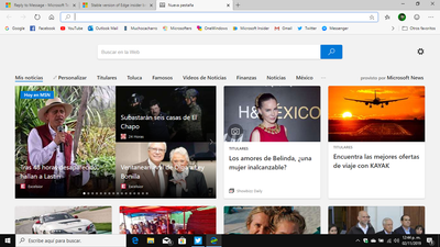
I just noticed that you add a option that solves this problem, and now looks more like the old edge.
If someone of the Edge Dev Team read this, im very glad with you, you are awsome.
Accepted Solutions
- Mark as New
- Bookmark
- Subscribe
- Mute
- Subscribe to RSS Feed
- Permalink
- Report Inappropriate Content
Jun 19 2019 12:24 PM
Solution@AleQC thanks for the feedback! I'm curious if you've tried other 'views' available from the hamburger menu above the search box (to the right). It sounds like you might like to try "informational" with the most recent sites turned off.
For the 'inspirational' view, we have tried to minimize information available without scrolling so you don't get distracted, and instead are 'inspired' :)


