- Home
- Microsoft 365
- Excel
- Pivot table - showing text value and multiple charts
Pivot table - showing text value and multiple charts
- Subscribe to RSS Feed
- Mark Discussion as New
- Mark Discussion as Read
- Pin this Discussion for Current User
- Bookmark
- Subscribe
- Printer Friendly Page
Apr 24 2018
05:58 AM
- last edited on
Jul 25 2018
09:48 AM
by
TechCommunityAP
- Mark as New
- Bookmark
- Subscribe
- Mute
- Subscribe to RSS Feed
- Permalink
- Report Inappropriate Content
Apr 24 2018
05:58 AM
- last edited on
Jul 25 2018
09:48 AM
by
TechCommunityAP
I hope that it is clear what I am trying to achieve here. You'll have to forgive me, I'm a complete and utter novice who navigates excel usually using just the standard buttons on the ribbon! I want to create a pivot table to show the varying different communications and events that happen within a given month within my organisation.
Desired Pivot
Ability to filter by month(s) with a general count of event/communication types. Then the ability to show more information for selected types (e.g. the date of).
Current data
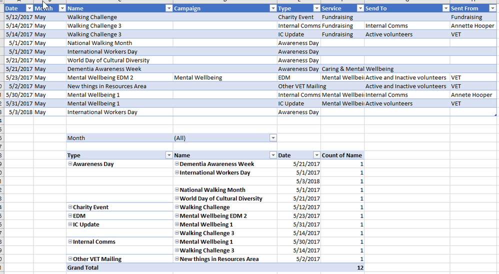
Columns: Date, Month, Name, Campaign, Type, Service/s, Send to and Sent from
NB. Campaign, services, send to and sent from will only have a value if the data is about a mailing rather than an Awareness Day or Charity event.
Pivot Attempt
My current Pivot is OK but not "quite there". I can filter with months and it'll show me all the happenings within that month, which is great but I want a little more, if possible.
1) For the date, sent from and send to information to show when I filter too (e.g. would know the Mental Wellbeing EDM would be sent on 23rd May to Active and Inactive volunteers from VET)
2) On a separate table (using same filter) to show a simple count of each type e.g. Filter to June, then show EDM - 4, Awareness Days - 5, Internal Comms - 3 etc.
3) The "service/s" column could have multiple options (e.g. caring and money, volunteering and fundraising) is there a way to count this. So I could say e.g. in May, there are 4 events which fall under Caring (this would count an EDM just noted as 'caring' in service column but also 3 awareness days which were put under services as 'mental wellbeing, caring and money' for example. (I hope that's clear??)
Any thoughts, really appreciated!
- Labels:
-
Charts & Visualizing Data
-
PivotTable
- Mark as New
- Bookmark
- Subscribe
- Mute
- Subscribe to RSS Feed
- Permalink
- Report Inappropriate Content
Apr 25 2018 12:14 PM - edited Apr 25 2018 12:16 PM
Calleigh-Marie-
Maybe try something like the attached file. You need to put the Pivot Table in Tabular Format (This is on the PivotTable Tools Tab > Layout > Report Layout (far left). Another option is to double click the counts. This will drill to the detail behind the summary figure.
- Mark as New
- Bookmark
- Subscribe
- Mute
- Subscribe to RSS Feed
- Permalink
- Report Inappropriate Content
May 16 2018 03:31 AM
Hi Matt,
That's really useful and actually really helped with what I was doing :) Thank you, I appreciate it. Could I ask for your expertise on another stumbling block?
I'd like to use the splicer to separate out topics. Issue is, many of the mailings/events above cover multiple topics c. e.g. Walking Challenge EDM could come under 'wellbeing' and 'volunteering'. As below:
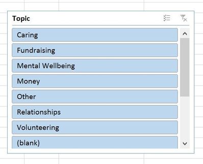
What I'd like to be able to do is have a splicer with a list of all the individual topics and be able to select multiple from that to show for example, all mailings including wellbeing as a topic. So the aforementioned example, would come up in a splice for both wellbeing and volunteering. Does that make sense? I'd like my splicer to look like this:
Currently under topics I'm having to type "Fundraising & Volunteering", "Fundraising & Other" etc. which isn't ideal when you see the Splicer.
Thanks in advance!!!!
- Mark as New
- Bookmark
- Subscribe
- Mute
- Subscribe to RSS Feed
- Permalink
- Report Inappropriate Content
May 16 2018 07:19 AM
Hey, happy that the previous file I provided was able to help you out a bit. I understand what you would like to do based on your description, however I don't think what you want is possible without modifying the data structure. I'm attaching the updated file for your reference (See attached). I believe you could do a few different things:
1. Before Worksheet: Use the Ctrl Key to filter on multiple selections within the slicer
2. After Worksheet: Modify the data to contain 1 row for each category.... i.e. a Fundraising and Volunteering record would become two records one for Fundraising and one for Volunteering. For a clear example please refer to the example file.
Hope this helps.


