- Home
- Microsoft 365
- Excel
- Create stacked column chart where 1st column is total, next 2 columns are segements of 1st column
Create stacked column chart where 1st column is total, next 2 columns are segements of 1st column
- Subscribe to RSS Feed
- Mark Discussion as New
- Mark Discussion as Read
- Pin this Discussion for Current User
- Bookmark
- Subscribe
- Printer Friendly Page
Feb 19 2018
07:33 AM
- last edited on
Jul 25 2018
09:45 AM
by
TechCommunityAP
- Mark as New
- Bookmark
- Subscribe
- Mute
- Subscribe to RSS Feed
- Permalink
- Report Inappropriate Content
Feb 19 2018
07:33 AM
- last edited on
Jul 25 2018
09:45 AM
by
TechCommunityAP
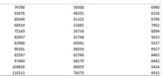
I have a pivot table with 3 columns of values. Column 1 is the entire population, and columns 2 + 3 are segments of that population with filters applied. I want to create a stacked column chart in excel where columns 2 + 3 are part of Column 1. Instead, it is summing all 3 columns. Here is the data and chart currently. I want the orange and grey area to be part of blue (total) column, instead of the 3 columns added together

- Labels:
-
Charts & Visualizing Data
-
Excel
- Mark as New
- Bookmark
- Subscribe
- Mute
- Subscribe to RSS Feed
- Permalink
- Report Inappropriate Content
Feb 19 2018 08:20 AM
SolutionHi George,
I guess you need clustered column graph, not stacked one. For clustered columns format Series Overlap as 100%
- Mark as New
- Bookmark
- Subscribe
- Mute
- Subscribe to RSS Feed
- Permalink
- Report Inappropriate Content
Feb 19 2018 08:37 AM
Great, that works! One follow up question:
1. How can I rearrange the order of stacking? Can I do that from the graph, instead of rearranging the pivot table columns?
- Mark as New
- Bookmark
- Subscribe
- Mute
- Subscribe to RSS Feed
- Permalink
- Report Inappropriate Content
Feb 19 2018 10:24 AM
that won't work with clustered columns. It shows you where the data ends, not the full size of the data in series. Thus the series with smallest data in it shall be at the bottom, and largest on the top.
Accepted Solutions
- Mark as New
- Bookmark
- Subscribe
- Mute
- Subscribe to RSS Feed
- Permalink
- Report Inappropriate Content
Feb 19 2018 08:20 AM
SolutionHi George,
I guess you need clustered column graph, not stacked one. For clustered columns format Series Overlap as 100%