- Subscribe to RSS Feed
- Mark Discussion as New
- Mark Discussion as Read
- Pin this Discussion for Current User
- Bookmark
- Subscribe
- Printer Friendly Page
Feb 06 2017
03:53 PM
- last edited on
Jul 12 2019
10:41 AM
by
TechCommunityAP
- Mark as New
- Bookmark
- Subscribe
- Mute
- Subscribe to RSS Feed
- Permalink
- Report Inappropriate Content
Feb 06 2017
03:53 PM
- last edited on
Jul 12 2019
10:41 AM
by
TechCommunityAP
Hello!
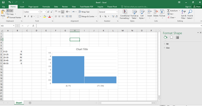
I am having great difficulty in figuring out what i am doing wrong. I have to create a Histograms based on the last 60 days of high temperatures for my Stats class. While i understand how to generate the Histogram... it does not generate correctly? Instead of data across the graph, i am getting One Bar on One value... and the Date in the Table to the left of the graph does not reflect the data i'm actually using.
- Labels:
-
BI & Data Analytics
-
Need Help
- Mark as New
- Bookmark
- Subscribe
- Mute
- Subscribe to RSS Feed
- Permalink
- Report Inappropriate Content
Feb 10 2017 01:48 PM
Hi Megan, can you attach an example file, or if not then some screen shots?
- Mark as New
- Bookmark
- Subscribe
- Mute
- Subscribe to RSS Feed
- Permalink
- Report Inappropriate Content
Feb 26 2017 11:35 AM
- Mark as New
- Bookmark
- Subscribe
- Mute
- Subscribe to RSS Feed
- Permalink
- Report Inappropriate Content
Feb 12 2018 12:22 PM
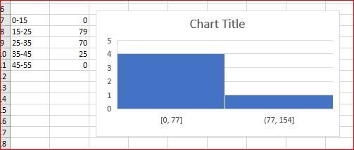
Similar Problem! Mine turns out to be a bit different tho. Here's the screenshot:
- Mark as New
- Bookmark
- Subscribe
- Mute
- Subscribe to RSS Feed
- Permalink
- Report Inappropriate Content
Feb 12 2018 12:24 PM
Hello!
I have a similar histogram problem! Mine turns out to be a bit different tho. Here's the screenshot:

- Mark as New
- Bookmark
- Subscribe
- Mute
- Subscribe to RSS Feed
- Permalink
- Report Inappropriate Content
Feb 12 2018 12:27 PM
Hello!
I have a similar histogram issue.

- Mark as New
- Bookmark
- Subscribe
- Mute
- Subscribe to RSS Feed
- Permalink
- Report Inappropriate Content
Feb 13 2018 01:50 AM
Hi,
With this initial chart
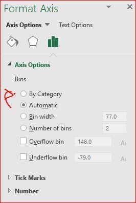
select X-axis formatting and change default Automatic on By Category
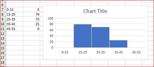
result will be like this
- Mark as New
- Bookmark
- Subscribe
- Mute
- Subscribe to RSS Feed
- Permalink
- Report Inappropriate Content
- Mark as New
- Bookmark
- Subscribe
- Mute
- Subscribe to RSS Feed
- Permalink
- Report Inappropriate Content
Mar 16 2018 11:41 AM
Hi. I have the same problem, but are using an Ipad. How can this be done in excel on Ipads?
- Mark as New
- Bookmark
- Subscribe
- Mute
- Subscribe to RSS Feed
- Permalink
- Report Inappropriate Content


