Turn on suggestions
Auto-suggest helps you quickly narrow down your search results by suggesting possible matches as you type.
- Home
- Security, Compliance, and Identity
- Microsoft Entra Blog
- Improving the branding logic of Azure AD login pages
Improving the branding logic of Azure AD login pages
- Subscribe to RSS Feed
- Mark as New
- Mark as Read
- Bookmark
- Subscribe
- Printer Friendly Page
- Report Inappropriate Content
Published
Sep 07 2018 08:43 AM
13K
Views
Sep 07 2018
08:43 AM
Sep 07 2018
08:43 AM
First published on CloudBlogs on Apr, 07 2017
Howdy folks, Today we're blogging to give you a heads up about some upcoming improvements we think you'll want to be aware of. We're making this set of improvements to the logic that drives app and company branding on Azure AD login pages. This change is going to make it easier for employees and B2B guests to understand how they are signing in and what apps they are signing into in a variety of different scenarios. Pretty much everyone we know is passionate about UX and branding, so we know this is likely to be a hot topic, so we want to give you an early heads up and explain the change. I've invited Ariel Gordon, one of the Program Managers on my team, to share more details about this change. As always, we want to hear from you about this experience, so leave us a comment below, or reach out to us on Yammer or Twitter. Best regards, Alex Simons (Twitter: @Alex_A_Simons ) Director or Program Management Microsoft Identity Division ----------------------- Hi everyone, We're continuing to make progress on converging the Azure AD and Microsoft account identity systems. One of the big changes our team is working on is realigning the user experiences ("the pixels") between the two systems. It's a big milestone that requires us to rationalize the way the two systems represent different brands in our sign-up and sign-in experiences. Proper branding is essential to establish context, help users feel secure, and help them know which account to use for a given interaction. Getting this right is tricky, because there can be up to four relevant and different brands for any sign-in flow:


Howdy folks, Today we're blogging to give you a heads up about some upcoming improvements we think you'll want to be aware of. We're making this set of improvements to the logic that drives app and company branding on Azure AD login pages. This change is going to make it easier for employees and B2B guests to understand how they are signing in and what apps they are signing into in a variety of different scenarios. Pretty much everyone we know is passionate about UX and branding, so we know this is likely to be a hot topic, so we want to give you an early heads up and explain the change. I've invited Ariel Gordon, one of the Program Managers on my team, to share more details about this change. As always, we want to hear from you about this experience, so leave us a comment below, or reach out to us on Yammer or Twitter. Best regards, Alex Simons (Twitter: @Alex_A_Simons ) Director or Program Management Microsoft Identity Division ----------------------- Hi everyone, We're continuing to make progress on converging the Azure AD and Microsoft account identity systems. One of the big changes our team is working on is realigning the user experiences ("the pixels") between the two systems. It's a big milestone that requires us to rationalize the way the two systems represent different brands in our sign-up and sign-in experiences. Proper branding is essential to establish context, help users feel secure, and help them know which account to use for a given interaction. Getting this right is tricky, because there can be up to four relevant and different brands for any sign-in flow:
- The brand of the app that the user is signing into, or providing consent for (e.g. Office)
- The brand of the organization that owns the resource (e.g. the app belongs to Fabrikam)
- The brand of the organization that the user is a member of (e.g. user is a Contoso employee)
- The brand of the platform/service provider (e.g. Microsoft).
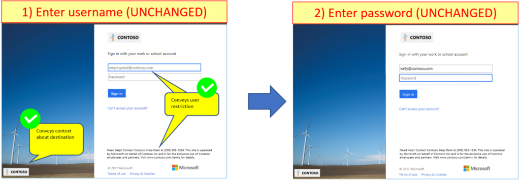
Brand presentation scenarios
The screenshots below illustrate the four main use cases.#1: Contoso employee goes to a generic app URL (e.g. www.office.com)
In this example, a Contoso user is signing into a mobile application, or into a web application using a generic URL. The illustration on the left will always represent the app brand, and the interaction pane on the right will update to show Contoso elements when appropriate.
#2: Contoso employee goes to a Contoso app that's restricted to internal users (e.g. outlook.com/contoso.com)
In this example, a Contoso user is signing into an internal application using a company-specific URL. The illustration on the left represents the company brand (Contoso). The interaction pane on the right is locked to Contoso and helps employees through sign-in.
#3: Contoso employee goes to a Contoso app that's open to external users (e.g. contoso.sharepoint.com)
In this example, users are signing into a LoB application from Contoso but the user may or may not be a Contoso employee. The illustration on the left represent the resource owner (Contoso), just like case #2 above. But this time, the interaction pane on the right is not locked to Contoso, to convey that external users are welcome to sign in.
#4: Fabrikam employee goes to a Contoso app that's open to external users
In this final example, the application belongs to Contoso and the user who's signing in works for Fabrikam. The illustration on the left represents the resource owner (Contoso), and the interaction pane on the right dynamically updates to show relevant information to Fabrikam employees.
Wrapping up
This change in logic will give our partners better branding opportunities in a variety of B2B scenarios. Most users should either see a positive change or no change at all. If you are interested in learning more, check out the documentation. We want to hear from you about this change, so please keep the feedback coming! Thanks Ariel Gordon (Twitter: @askariel)
0
Likes
1 Comment
You must be a registered user to add a comment. If you've already registered, sign in. Otherwise, register and sign in.